LabPlot 2.6 released
We are happy to announce the next release of LabPlot! As usual, in the release announcement we want to introduce the major points in the new release. Some of the new developments were already described in the previous blog posts were we reported on the ongoing achievements. Many other smaller and bigger improvements, bug fixes and new features were done in this release. The full list of changes that are worth to be mentioned is available in our changelog.
LabPlot has already quite a good feature set that allows to create 2D Cartesian plots with a lot of editing possibilities and with a good variety of different data sources supported. Analysis functionality is also getting more and more extended and matured with every release. Based on the overall good foundation it’s time now to take care also of other plot types and visualization techniques. As part of the next release 2.6 we ship the histogram:
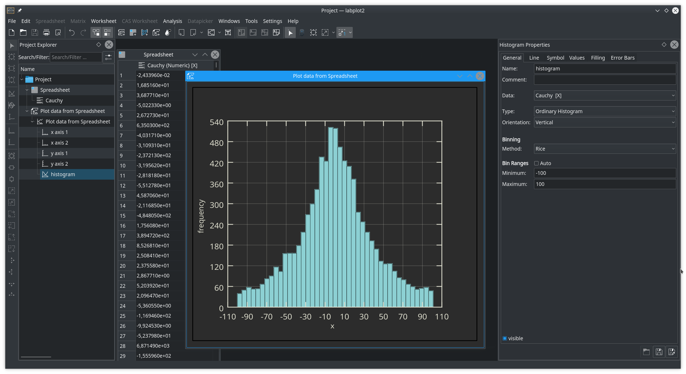
We dedicated a separate blog post already to this important new feature where the different options around this visualization technique are described.
The second big new feature is the support for the MQTT protocol. With LabPlot 2.6 is is possible now to read live data from MQTT brokers. This feature was contributed by Ferencz Kovács during Google Summer of Code 2018. His blog contains a lot of information about the progress in his project as well as a lot of demos.
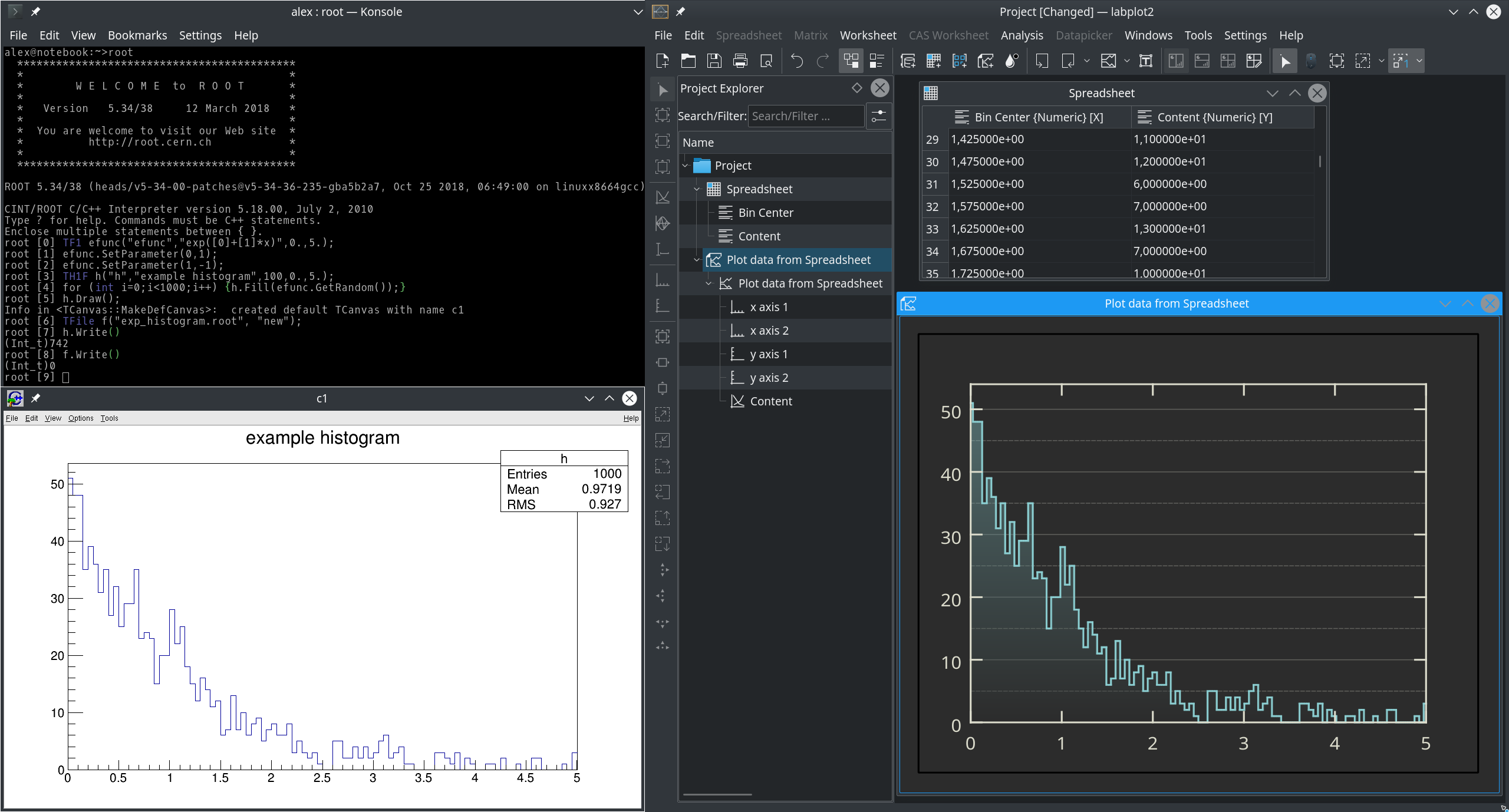
The number of supported file formats that can be imported into LabPlot was further extended in this release. We support now ROOT‘s trees and tuples, and especially ROOT’s histograms which were already introduced in the previous blog:
Further new supported formats are Ngspice raw files (ASCII and binary) and JSON format (JSON arrays and objects)
Ngspice raw files and ROOT files can also be used as a live data source – in this mode LabPlot monitors the external files, re-reads them completely on changes and updates the visualization of the data. See this blog post for an example video demoing such a workflow.
The import of data from SQL databases was implemented already in the previous release. Unfortunately, the handling of ODBC connections was not implemented correctly in the past. In this release we fixed this.
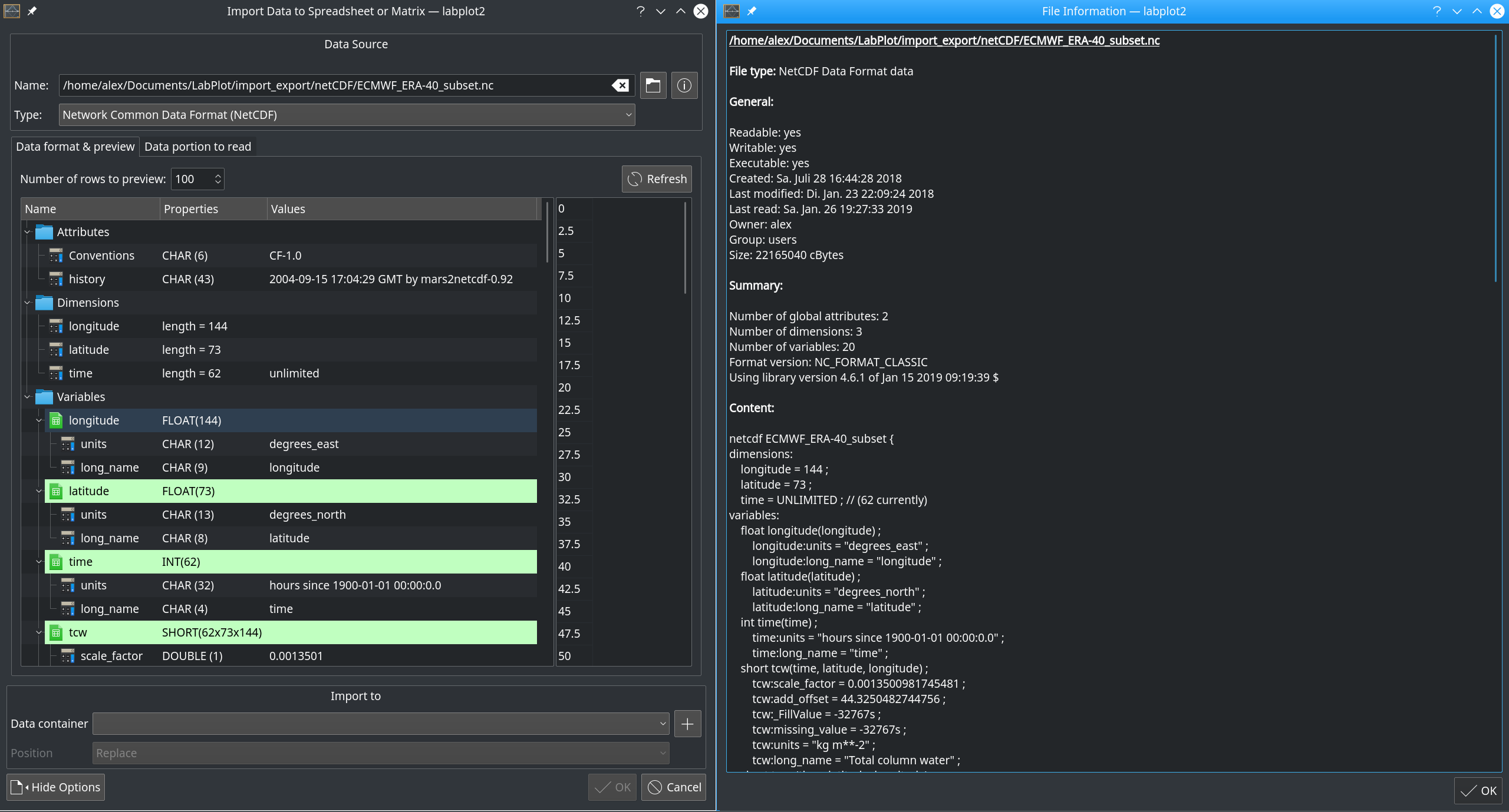
The “File Info” Dialog was extended and shows now format specific information for the selected file, like the number of attributes, dimensions and variable for netCDF etc.:
Also for this release there was quite a good progress in the area of data analysis functions in LabPlot. Convolution/Deconvolution and Cross-/Autocorrelation of data sets with many different options (sampling interval, linear/circular, normalization, etc.) joined the family of analysis functions in 2.6
For the worksheet, couple of new features and improvements were developed. Here we want to mention the new ability to rotate plot legends and to use different border shapes for labels (rectangle, eclipse, etc.) and a better positioning of rotated axis tick labels.
While working with plots it is sometimes desired to avoid unwanted occasional panning and zooming in the plot triggered by mouse drag and wheel events. For this we added a new option which allows to make plots non-interactive.
In the spreadsheet, in addition to the already available methods for data generation (fill with constant values, mathematical function values, random values, etc.) there are now functions for quick data manipulation – add and subtract a value and multiply and divide by a value. Similar functionality was also implemented for matrix data containers.
When exporting a worksheet to a text file, we allow to specify the number format in the export options – similarly to how this is done during the import. Furthermore, it is possible now to export a spreadsheet into a Sqlite database.
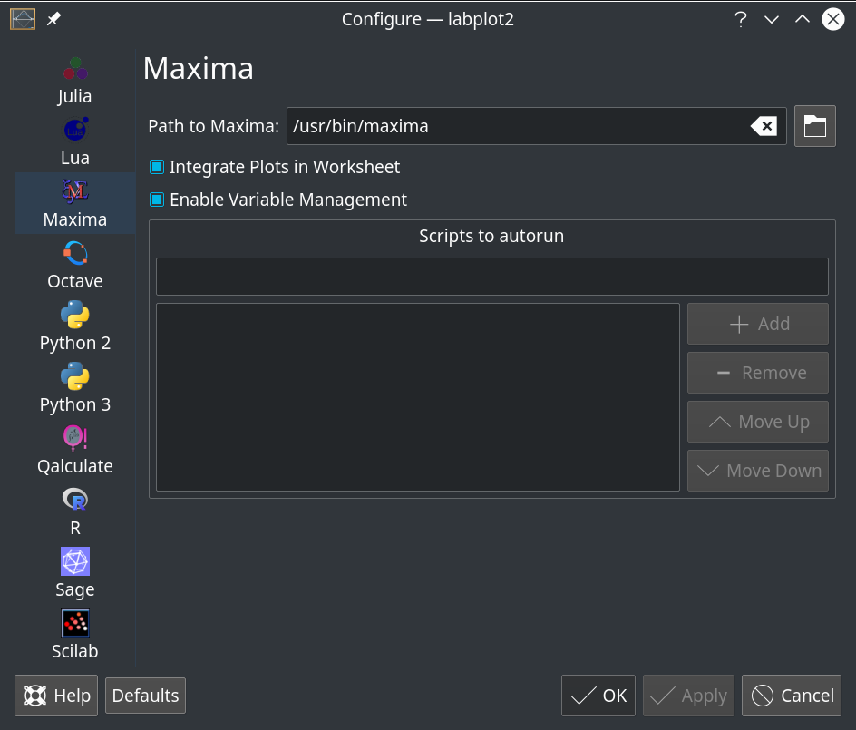
The integration of Cantor – KDE’s frontend for open-source computer algebra systems and programming languages – saw further improvements. It is possible now to modify the settings for different systems directly in LabPlot:
Cantor saw quite a great improvement in the last months. The recent blog Cantor 18.12 – KDE way of doing mathematics described the progress. Linux users benefit from their distributions shipping the current and up-to-date versions of LabPlot and Cantor. For Windows users we ship the current version of Cantor as part of our Windows installer with a working support for Octave, Python and Maxima:
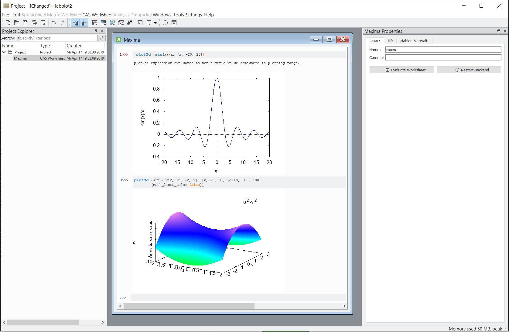
Octave part still have problems with the integrated plots and we plan to address this for the next release. Also, for the next release we plan to also have a working combination of LabPlot and Cantor for Mac OS X users. Even though the development of LabPlot and Cantor is done on Linux, we continue increasing our effort and the attention for these platforms, too.
All in all, it took some time to finalize the release. Again, many features implemented but still a lot in the backlog and already in the development. Also, Google Summer of Code 2019 is coming soon and we have couple of nice projects for this summer. So, stay tuned, give LabPlot a try and provide us feedback.
Thanks! I was looking forward for histograms, this release comes quite handy!
Tried LabPlot (2.4 as it is the current version in the Ubuntu 18.04 software repository). The import function removed any text present in a few test files. Moreover, even after reading the documentation, I was unable to generate a plot. Maybe LabPlot only makes sense as a power tool, and the lack of ergonomy for a new user is not really a problem. If this is not the case, either a more comprehensive documentation (with step by step examples) or a different workflow for future versions might be required.
Basically the workflow is like this:
* create a worksheet
* add a plot
* add a xy-curve
* select for x- and y-data columns from the spreadsheet containing your data
Creation of object is done either via the main menu, via the context menu in the project explorer or via the corresponding buttons in the toolbar.
If you want to plot a mathematical function, in the last step create a “xy equation curve” instead of “xy-curve” and specify the mathematical expression.
In 2.5 we greatly improved the UX to speed-up the creation of plots – https://labplot.kde.org/2017/09/21/short-update-on-recent-ux-improvements/
Would it be possible for you to update to the current version 2.6?
We definitely need to improve the documentation, yes…
Didn’t know this project existed until today. I downloaded it and am I trying it out now. It looks great with the dark theme.
I don’t know why the Windows version only has plotting functions of xy curve and histogram. It is my first time use the Labplot. I am not sure if the software can plot polar, 3D, double YY curve, or not.
We have xy-curve and historgrams only at the moment. More to come in future…