Short update on recent UX improvements
One of the usual data visualization workflows supported by LabPlot involves the import of some external data into the application and the creation of plots. Once the data is imported, e.g. into a spreadsheet, there are basically the following steps to do in order to get the data visualized:
- create a worksheet (if not available yet)
- add a plot (if not available yet)
- add a xy-curve to the plot and select the spreadsheet columns as data sources for the curve
Despite the apparently small number of steps required here, this can result in a lot of tedious work if you need to plot many different imported data sets in one or several plots.
For the upcoming release we decided to improve here and to provide the user a more faster way to get the data plotted. The new “Plot Data” dialog, reachable via the context menu of the spreadsheet, helps the user to create all the intermediate steps mentioned above for many data sets in one single step:
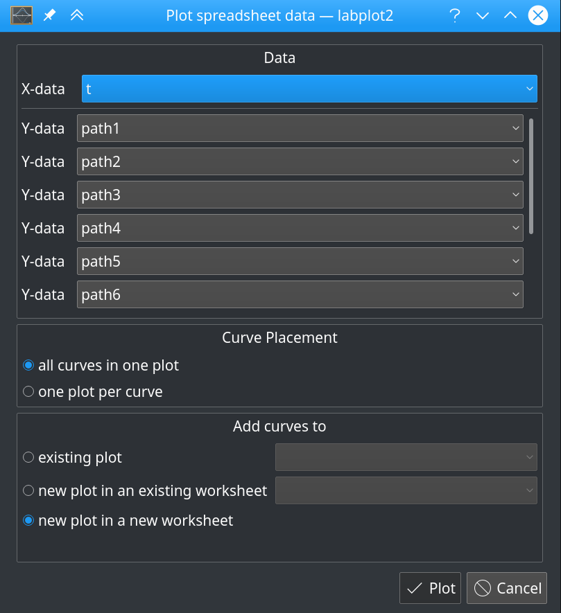
In this dialog, the process of creation of all the required objects can be influenced via different options where the user can decide how many plots to create and where to add the generated curves. The dialog respects the selection in the worksheet and only the selected columns are plotted. In case nothing is selected in the spreadsheet, all data sets (columns) are considered:
When generating curves, LabPlot tries to automatically recognize the column that has to be used as the source for the x-data by evaluating the “plot designation” property attached to every column in the spreadsheet. This greatly helps if you need to plot a set of data series having the same x-values (usually an index or timestamp). In case there is no column with the plot designation “X”, the first selected column is used as X.
Similar for data analysis: if you wanted to, let’s say, smooth some data in a spreadsheet and to compare the result with the original data in a plot, you had previously to
- create a worksheet (if not available yet)
- add a plot (if not available yet)
- add a xy-curve to the plot and select the spreadsheet columns as data sources for the curve
- add a smoothing curve and select the spreadsheet columns as data sources for the smooth curve
- click on the “Recalculate” button to perform the calculation of the smoothed data
Also this kind of tasks can result in a lot of manual tedious work, which already was the reason for some user complains. We addressed this, too. With the recent improvements in LabPlot, you simply select the corresponding analysis function from the “Analyze and plot data” sub-menu in spreadsheet’s context menu and let LabPlot do all the required steps
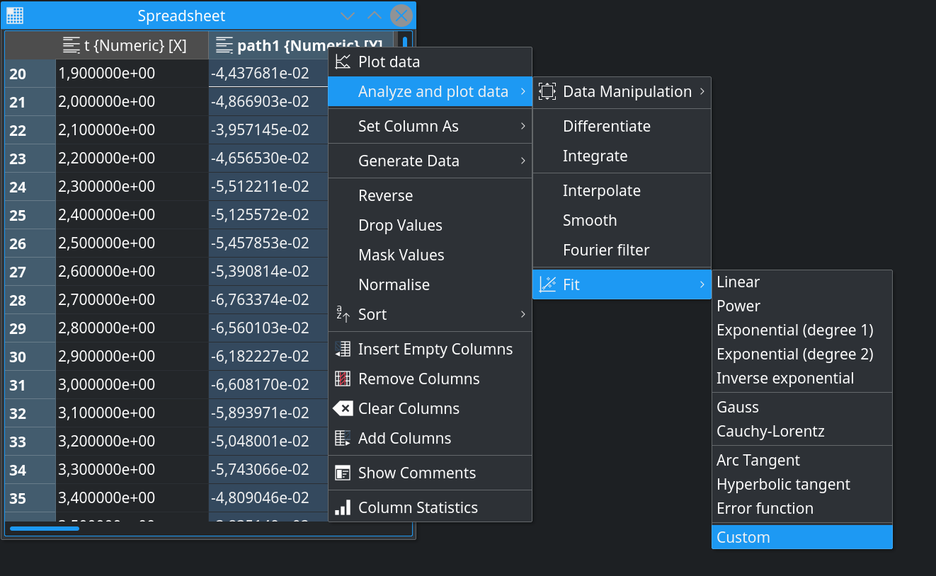
The procedure here is basically the same as described above with the only difference that the user has now the chance to additionally decide in the “Plot Data” dialog whether they want to plot the result of the analysis function together with the original data or to plot the result curve only.
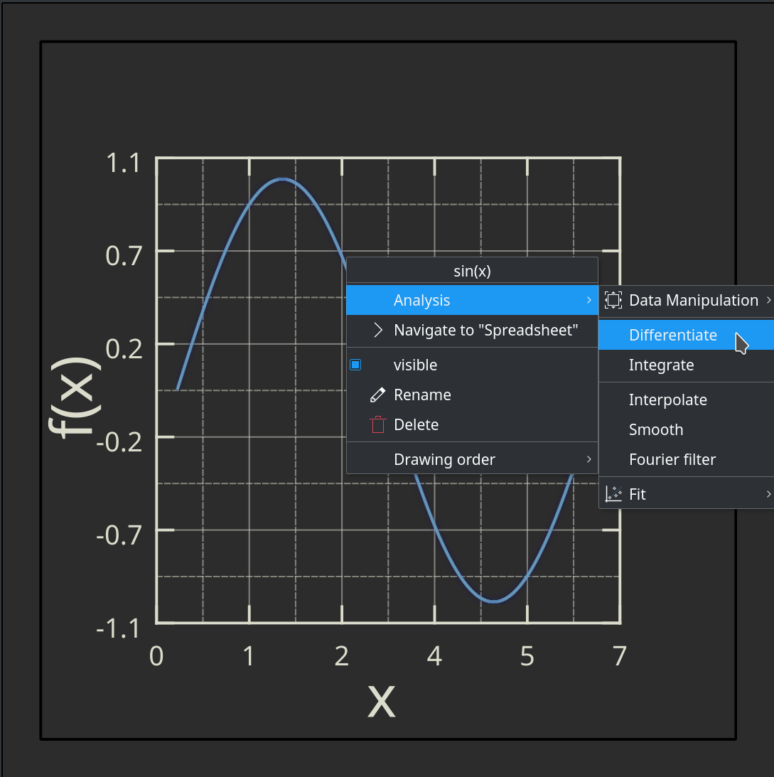
With the analysis workflow sketched above, the analysis was initiated from the spreadsheet. For the use cases where you already have the data plotted and now want to smooth the already visualized data, to fit a certain model to the data, etc., you can initiate the analysis step via the context menu of the curve directly in the plot:
To further speed up the creation of data visualizations, we implemented the feature that allows the user to simply drag the columns in the project explorer and to drop them on the already existing plots – either by dropping in the Project Explorer or by dropping in the worksheet:
Until the next release, planned for December this year, we still have some time for fine-tuning and fixing the remaining issues in the new features and improvements briefly described here. All of them are already available in master and can be tried out.