Support for live data
Coming close to the next release of LabPlot, the last new feature in this release that we want to introduce is the support for live data. This feature developed by Fábián Kristóf during “Google Summer of Code 2017” program. In this context, the support for live data refers to the data that is frequently changing and the ability of the application to visualize this changing data.
Prior to the upcoming release, the only supported workflow in LabPlot was to import the data from an external file into LabPlot’s data containers and to do the visualization. On data changes, the user needed to re-import again. With LabPlot 2.5 we introduced the “Live Data Source” object that is “connected” to the actual data source and that takes care of re-reading the changed data according to the specified options.
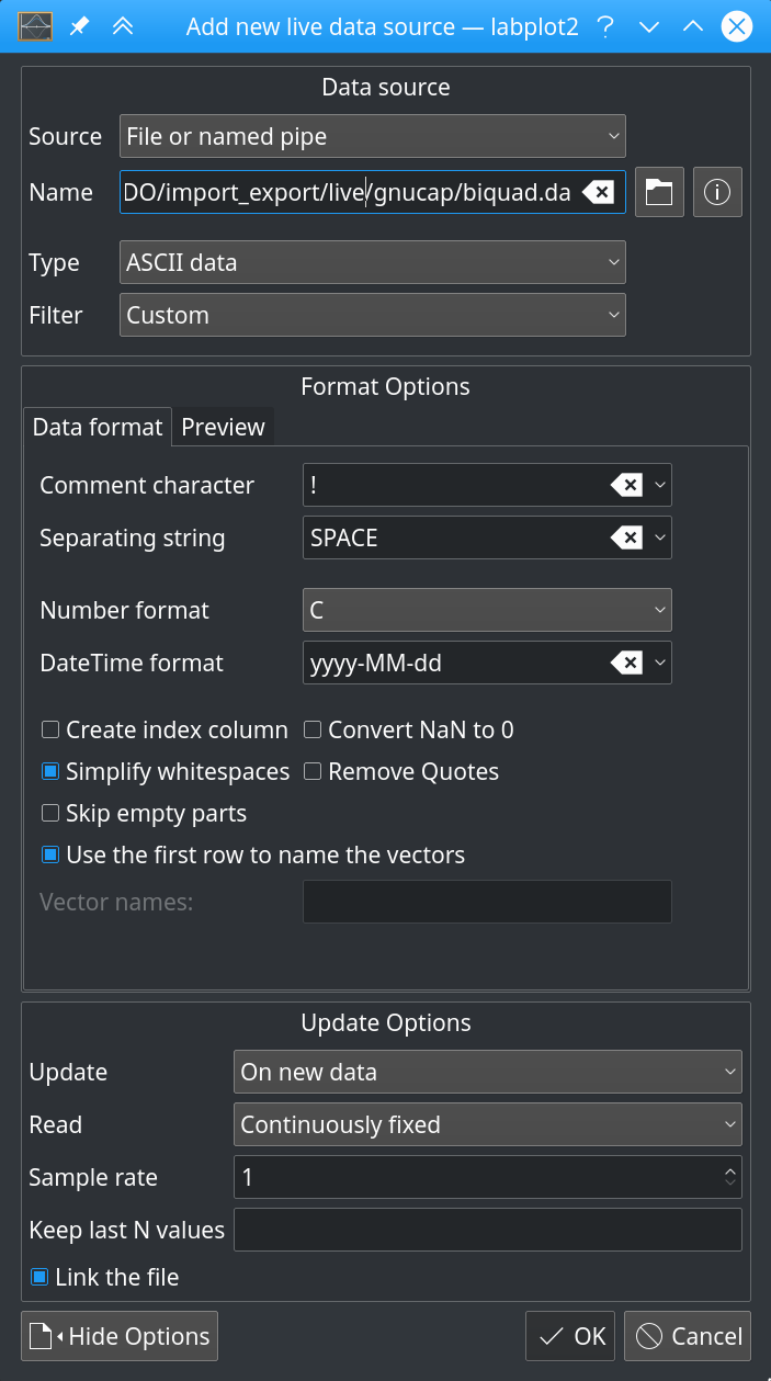
The supported data source are files and named pipes, Unix/UDP/TCP sockets and serial port. The data can be read periodically where the user can specify the time interval for when to read the new data or alternatively on data changes. At the moment, the only supported formats are ASCII and binary data.
The consumption of the data in plots is pretty much the same as when using spreadsheets – the user simply selects the columns in such a live data source object as the sources of the data to be plotted.
The following video shows a combination of Gnucap and LabPlot and demonstrates LabPlot’s ability to monitor a file, to re-read it on changes and to automatically update the visualization of the data. A small application written in python and Qt controls the definition of Gnucap’s circuit file for a biquad filter. The user is able to change the values of the resistances via changing the values of the sliders. After each change, the circuit simulation is re-calculated in Gnucap to obtain the frequency response of the filter. The results of the simulation are written out to a file which is consumed by LabPlot in a “Live Data Source” object. The Bode plot in LabPlot is updated automatically on every change of one of the resistance values.
This example was contributed by Orestes Mas from the Technical University of Catalonia. Fábián’s blog contains more examples and details for this feature.
Another feature that is not directly related to the actual reading of live data but that comes in handy when dealing with such data is the ability to quickly specify the amount of data points that has to be plotted. In addition to the already available “free ranges” where the user can freely navigate through the data, the options “Show first N points” and “Show last N points” were added in the plot. Couple of examples for this new data range options are given in another blog post.