
LabPlot 2.9 released
LabPlot 2.9 released
After a long development and additional testing and beta phases, we’re happy to announce the availability of the next release of LabPlot. In this release we’re bringing again a significant amount of new features and improvements in different areas of LabPlot. The major new features are introduced further below. For more detailed review of the changes in the new release we refer to our ChangeLog file.
In addition to the new functionality added in 2.9, the users will benefit from performance improvements when importing and plotting big amount of data. With this we want to address the needs of users who need to plot several millions of data points and more will come for this in future.
As usual, the source code of LabPlot, the Flatpak and Snap packages for Linux as well as the installer for Windows and the image for macOS are available on our download page.
We’re always interested in user’s feedback and invite everybody who wants to discuss the currently available features or features that should be added in the future releases to join our Matrix Room and to get in touch with us.
What’s new in 2.9?
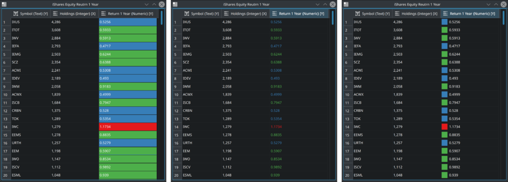
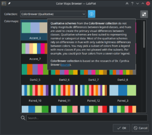
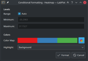
Color Maps and Conditional Formatting
A collection of multiple well-known color maps and conditional formatting of the data in the spreadsheet
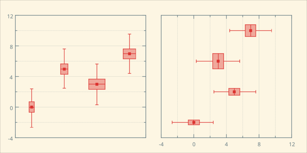
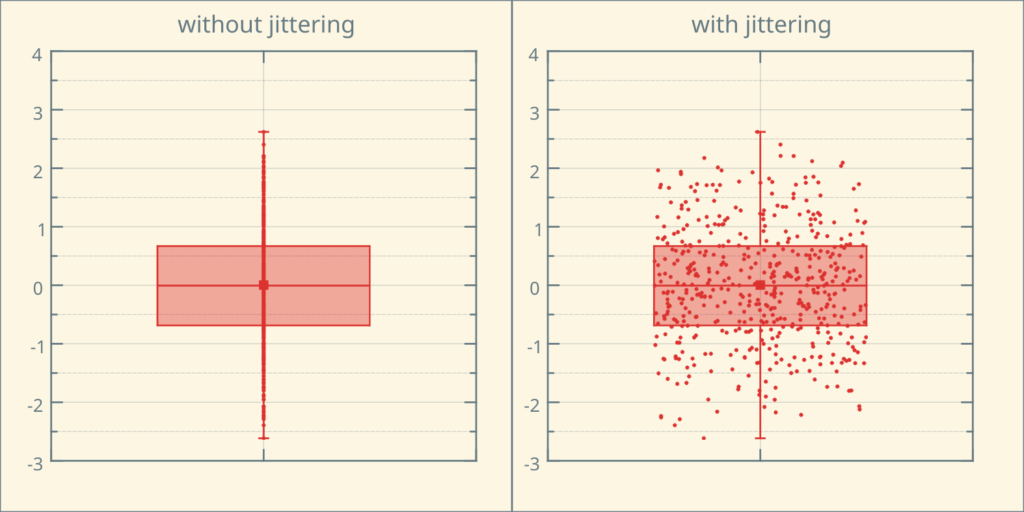
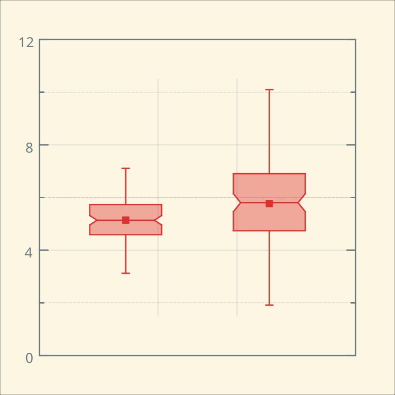
Box Plot
New visualization type – box plot – providing a quick summary of the basic statistical properties of the data set
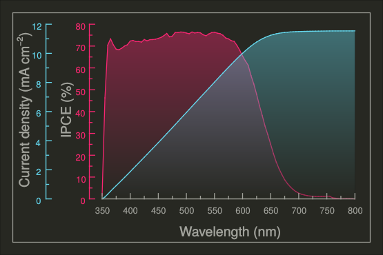
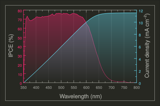
Multi-Axes
Plot the data against multiple and different axes
Info and Image Elements
New worksheet elements to annotate curve data point and to show images on the worksheet.
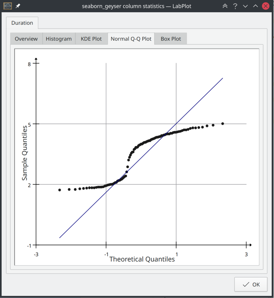
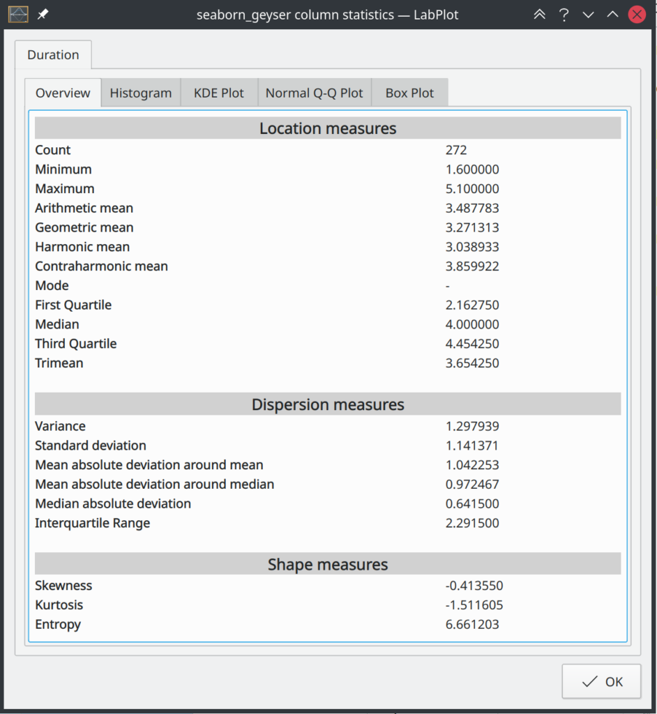
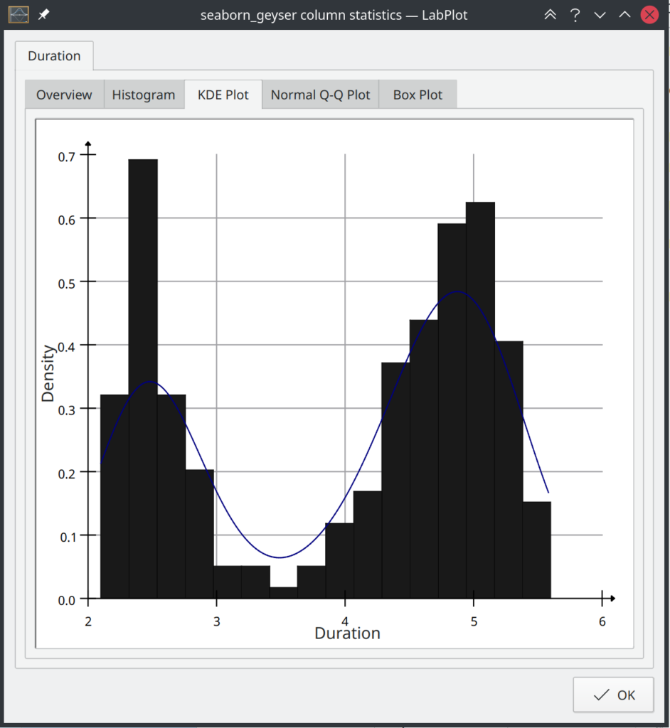
Column Statistics
Get insights into the structure of your data and its statistical properties directly in the spreadsheet. A new dialog to show the …
Hilbert Transform
Added Hilbert transform to the set of analysis functions
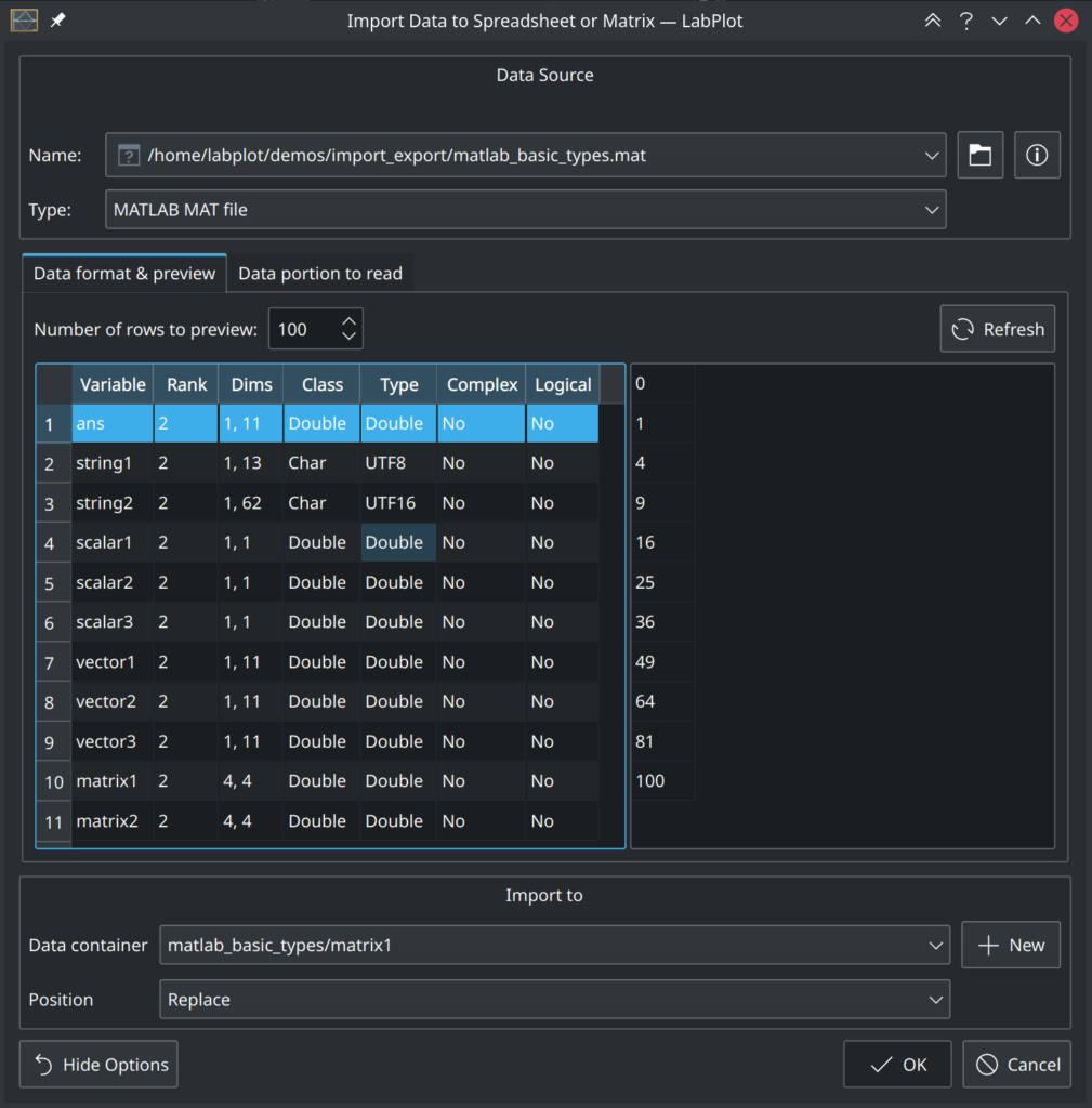
MATLAB, SAS, Stata and SPSS formats
Support for new data formats widely used in scientific communities