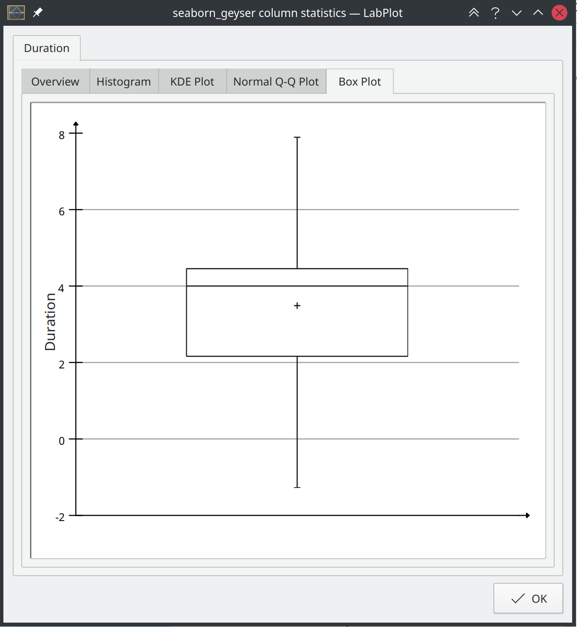
Box Plot
In one of our previous blog posts we wrote about the new development in the spreadsheet and the extension in the statistics dialog that now make use of new visualization elements. One of these elements is the Box Plot:
Of course, this new visualization type is not only available in the statistics dialog in the spreadsheet, but it can also be used in the Worksheet, in the area where LabPlot plots the data. In this blog post we will introduce this important new development, as it is going to be part of the next release.
A box plot (also known as a box-and-whisker plot) provides a quick visual summary of the important aspects of a distribution of values contained in a data set:
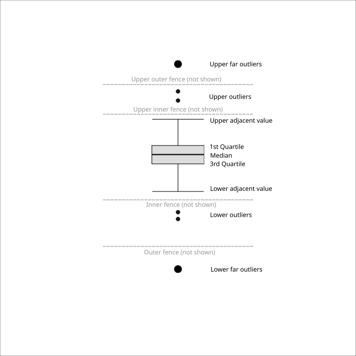
A more detailed description of the components of a box plot can be found in our documentation.
Even though this is the first release of this visualization type, we decided to implement many features for this very powerful visualization tool. LabPlot’s box plots supports different orientations (horizontal and vertical), different types of whiskers, variable widths, plotting of multiple data sets in one plot, and much more. A great variety of box plot visualizations can be achieved by using and combining the available options. To give you an idea of what is possible in LabPlot see below a couple of examples.
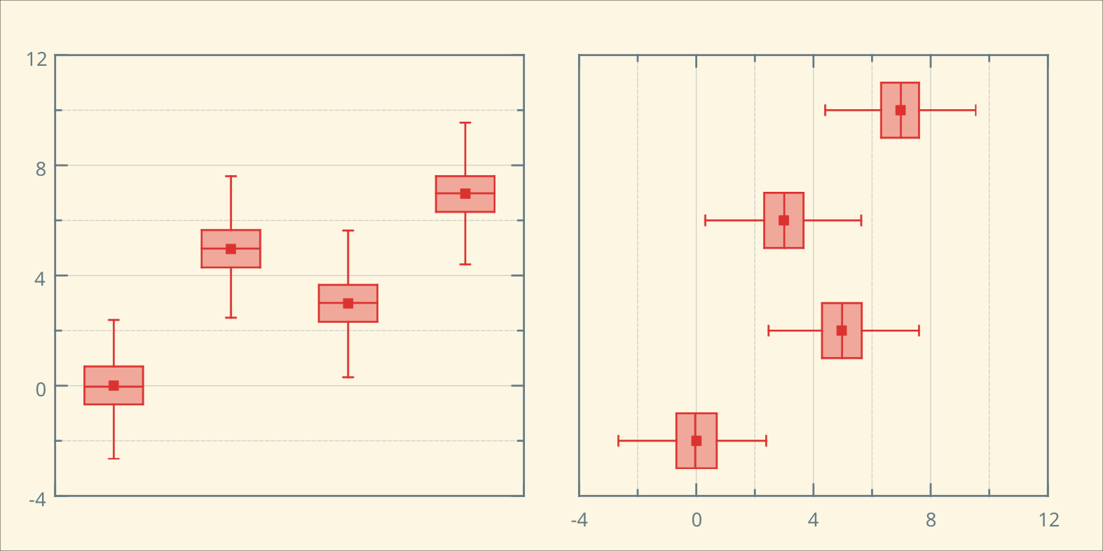
The first examples demonstrate the visualization of multiple data sets using different orientations of the box plots and working with and without the variable width of the box (width proportional to the square root of the number of data points):

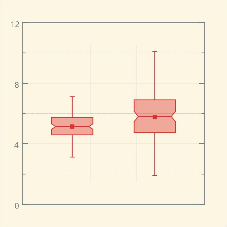
Box plots, laid out side-by-side, allow a visual comparison between different batches of data in four aspects regarding level, spread, shape and potential outliers. The notches on the sides of box plots permit a more refined comparison by providing a rough measurement of the significance of the differences between medians. They define a confidence interval around the median that has been adjusted to make it appropriate for comparisons of two boxes:
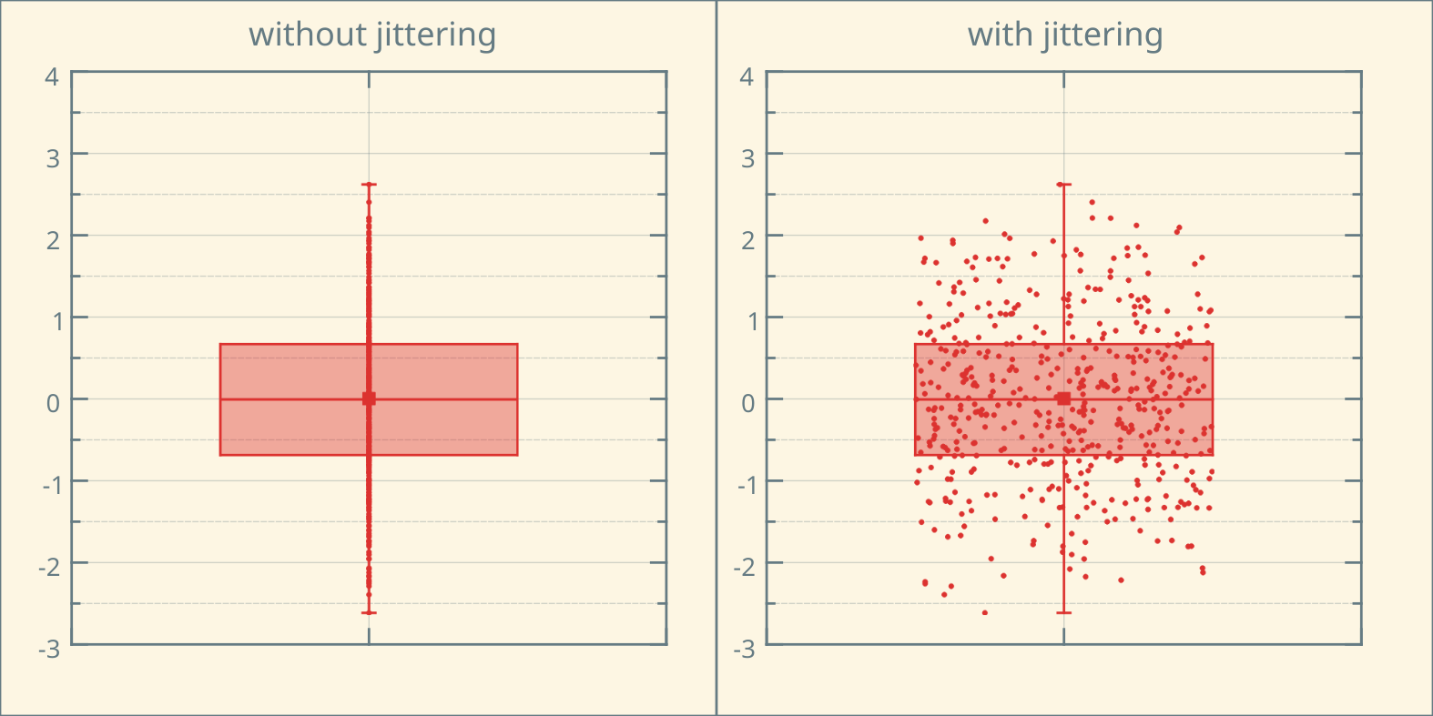
A box plot can hide the details of the actual distribution. Showing the data points on top of the box plot can reveal the underlying structures of the data. In case the data set is big and plotting of many data points doesn’t lead to nice looking results, the “jittering” (adding random noise over the data points) can be used. The example below shows the data points plotted on top of the box plot, with and without jittering:

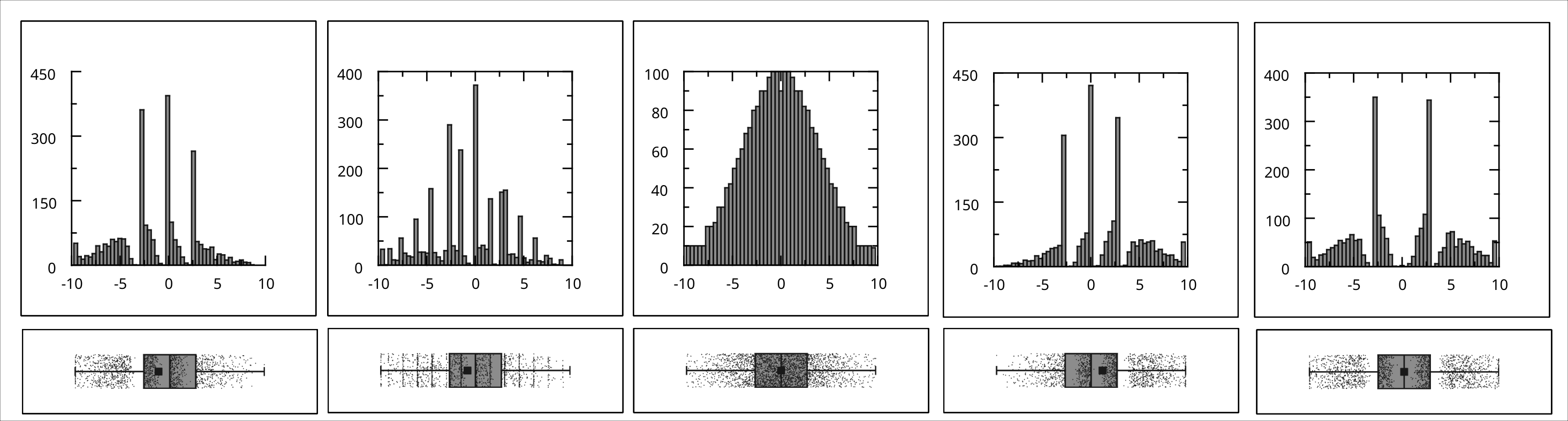
In many cases, a more powerful representation and interpretation of the data can be achieved by putting multiple visualization elements together. In addition to jittering, a combined visualization of a histogram and a box plot can be used to provide more insight. The example below shows five datasets (taken from the same stats, different graphs) that have completely different distributions but lead to the same box plot visualizations. The combination of box plots and histograms helps reveal the underlying structure of the data sets:
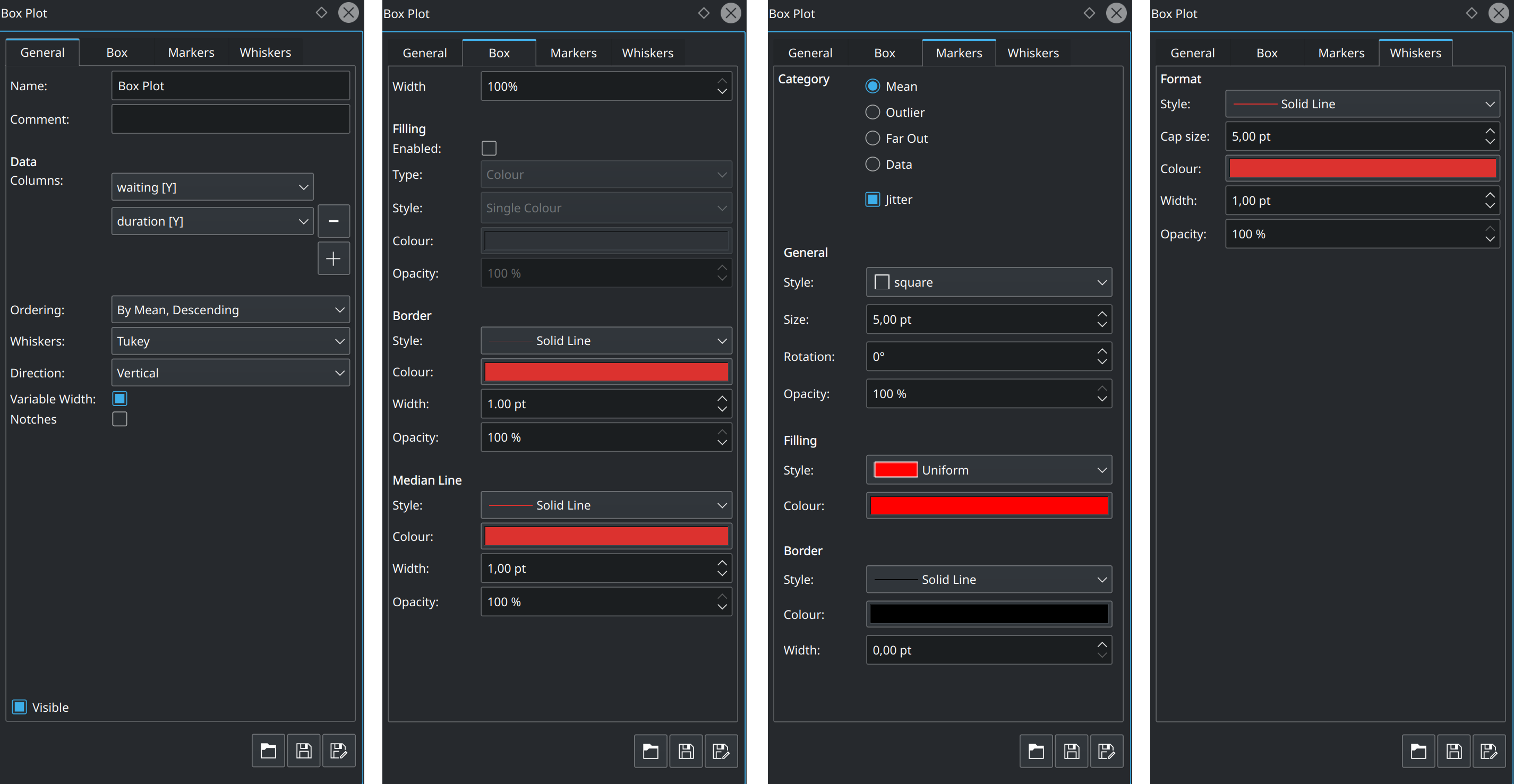
As usual, LabPlot provides full flexibility when defining the appearance of the box plot in the Properties Explorer. You can set the properties of lines, colors, different symbol styles for different “markers” (outliers, far out values, median and data points), and more:
The box plot feature has already been in master for quite some time and has reached stability and maturity. We consider it is worth now introducing to you, our users, and inviting you to test it in our nightly builds so you can provide us feedback.