More Statistics
Right now the feature set of LabPlot that can be used for the statistical analysis is very limited – we only show some values from the descriptive statistics for the selected data set in the spreadsheet. While we’re thinking about which features to add and which workflows to enable in our application to support this kind of analysis in near future, we decided to implement and to add some “quick wins” now.
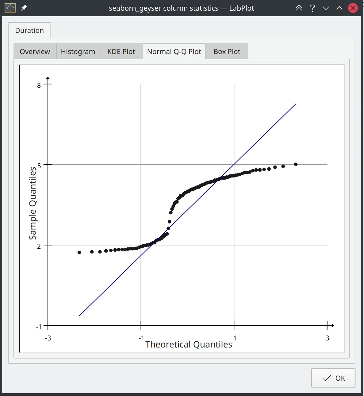
The column statistics dialog in the spreadshet that was showing the descriptive statistics only was extended recently by some additional visualizations. In the new tabs in this dialog the user can see now the histogram, the KDE plot with a normalized histogram, the Q-Q plot and the box plot for the selected data set:
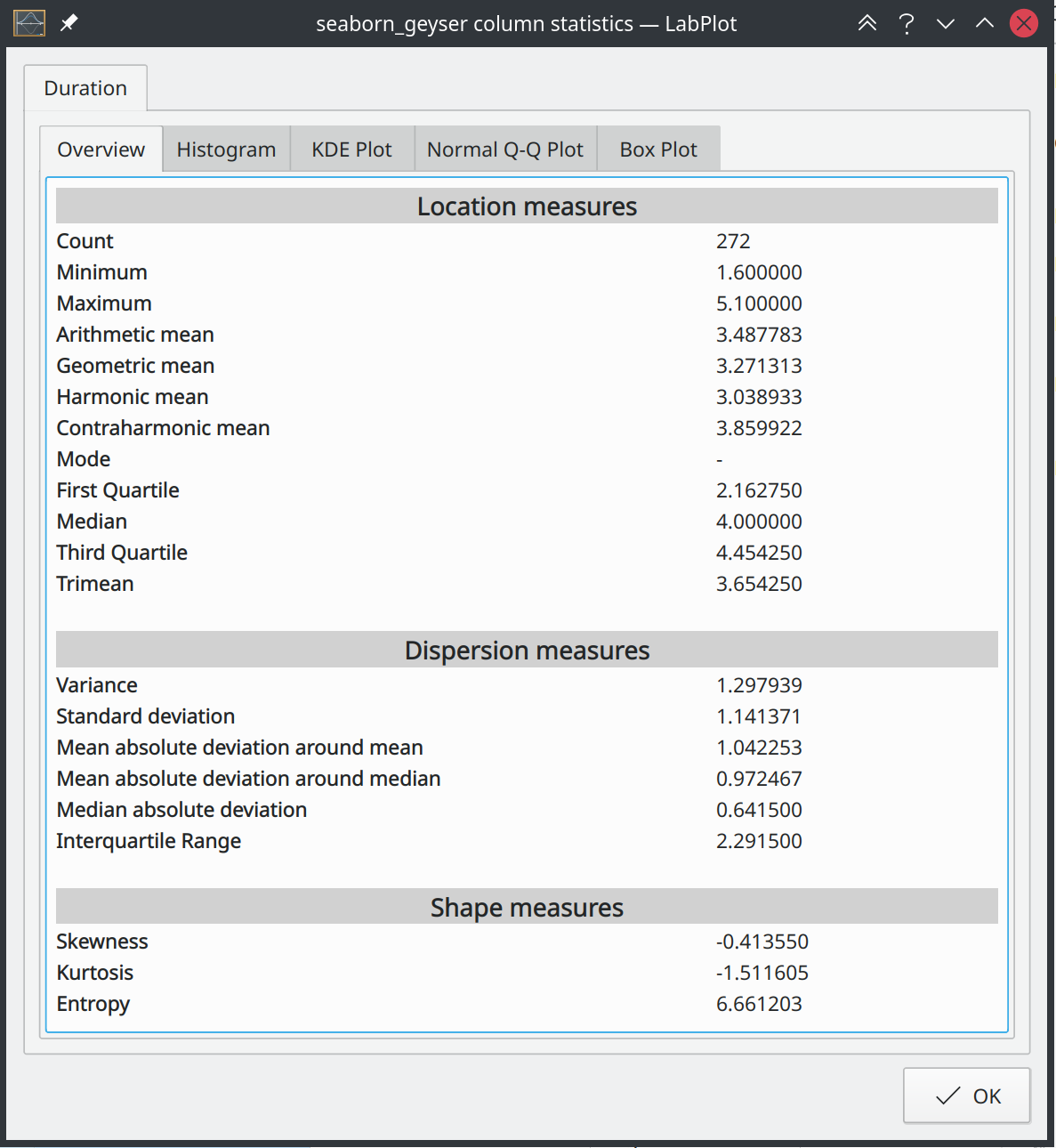
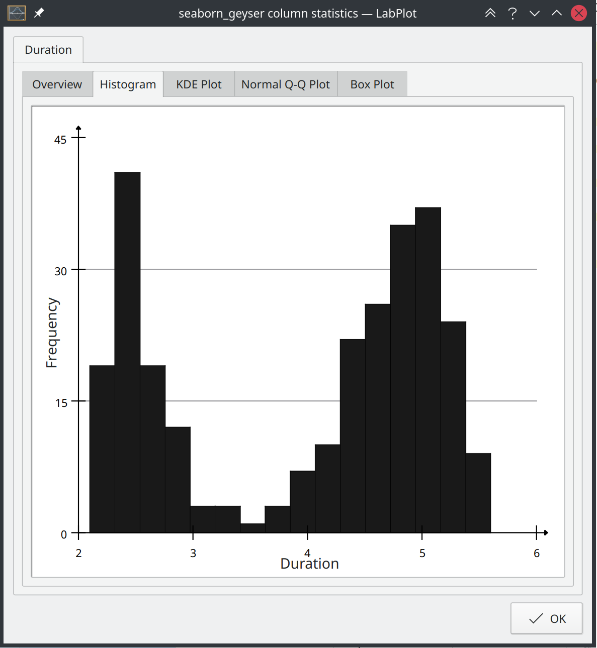
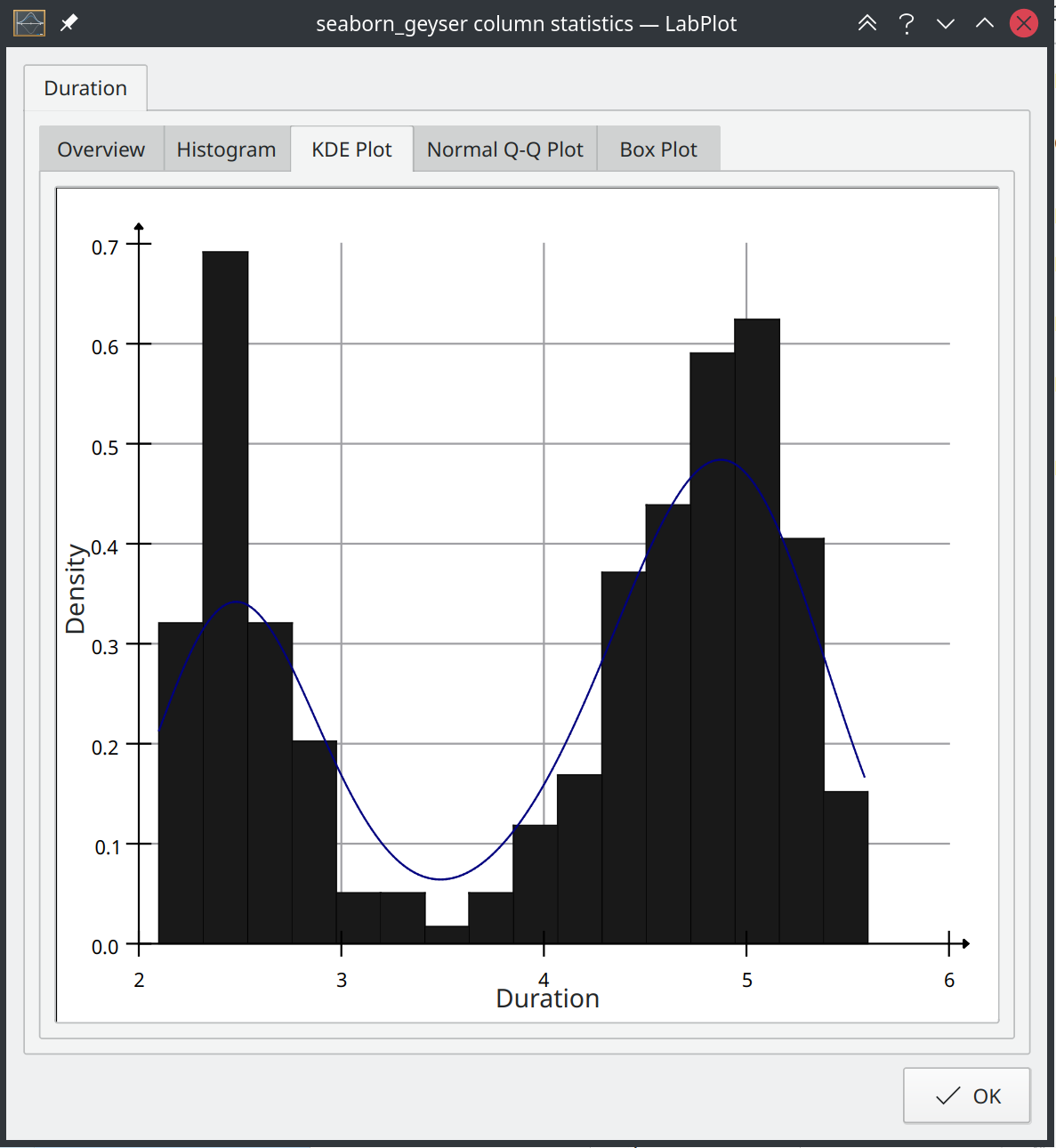

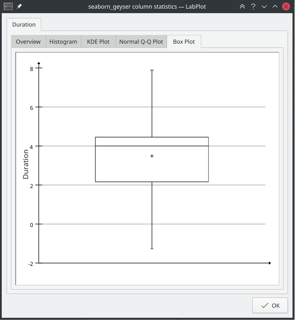
With these additional visualizations the user can get a faster and better overview of the data without leaving the spreadsheet.
The next natural step for this feature would be to enable this functionality in the worksheet and to extend it. E.g., it should be possible for the user to create such a Q-Q plot on the worksheet and to specify which probability distribution to use to compare the data set quantiles against. Similar for the KDE-plot where it should be possible to specify the kernel or for the box plot where the user can modify the type of the whiskers, etc.
This new feature is in master already and is ready to be used and tested. It’s going to be part of the upcoming release 2.9.