LabPlot 2.8 Released
After almost a year’s work and a month in beta, we’re happy to announce the availability of the next release of LabPlot: version 2.8 is at last here.
In this release announcement we will highlight the most important new features, so be prepared for a long post! For a shorter version of what has been done, check the ChangeLog… Or why not directly download the new release and experience LabPlot 2.8 for yourself?
Educational Data Sets
In 2.8 we made it easier to access many online resources that provide data sets for educational purposes. These data sets cover a variety of different areas, such as physics, statistics, medicine, etc., and are usually organized in collections. In this first release of this feature in LabPlot we have included five collections with over 2000 documented data sets:
- JSE Data Archive is a data archive provided by the Journal of Statistics Education.
- The R data sets are a collection of over 1300 data sets that were originally distributed alongside the statistical software environment R and some of its add-on packages.
- Australasian Data and Story Library (OzDASL) is a library of data sets and associated stories maintained mostly by teachers of statistics in Australia and New Zealand, with emphasis on data sets with an Australasian context.
- StatLib is an archive maintained at Carnegie Melon University.
- The Data And Story Library (DASL) is a library maintained by Data Description, creator of the data analysis and exploration software “Data Desk”.
The import dialog for data sets allows for an easy navigation and search in the thematically grouped categories and sub-categories of the data sets. The short video below demonstrates this and how to actually import a set:
For more details on this new feature see the dedicated blog post.
Worksheet
Next up: plotting capabilities. This release comes with two new worksheet objects – reference lines and image elements. Reference lines can be freely positioned on the plot to highlight certain values in the visualized data. Image elements let you add an image to the plot or worksheet. The example below, showing statistics of the amount of debris created and left floating in space since 1961, demonstrates the usage of these two new objects:
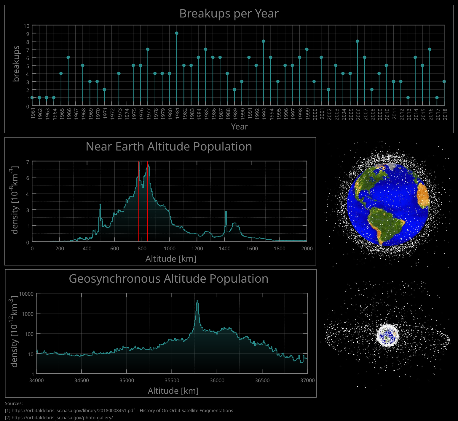
For more information about the data shown here and about the new worksheet elements see this blog post.
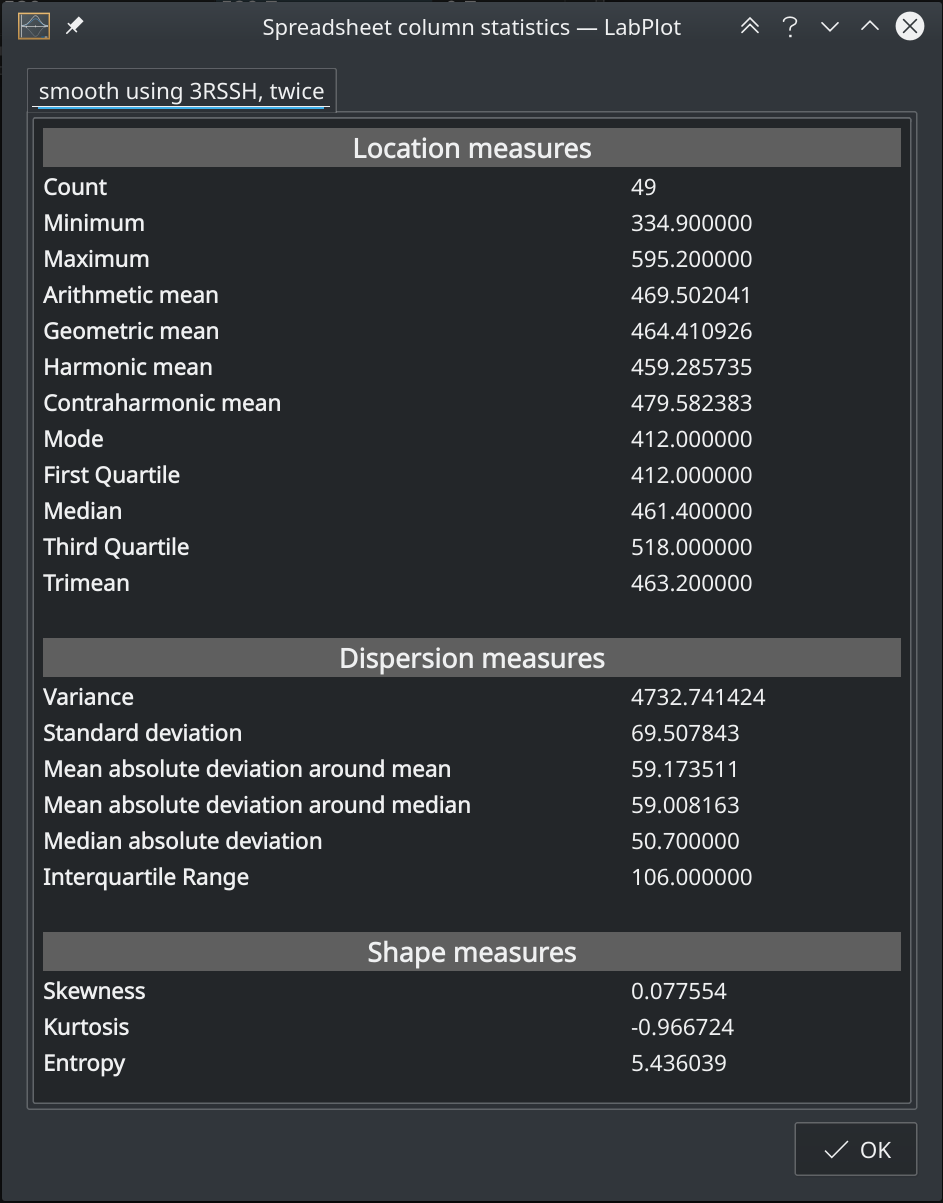
Spreadsheet
The spreadsheet provides descriptive statistics for the data sets. We extended this information and added the calculation of quartiles, trimean and of the statistical mode:
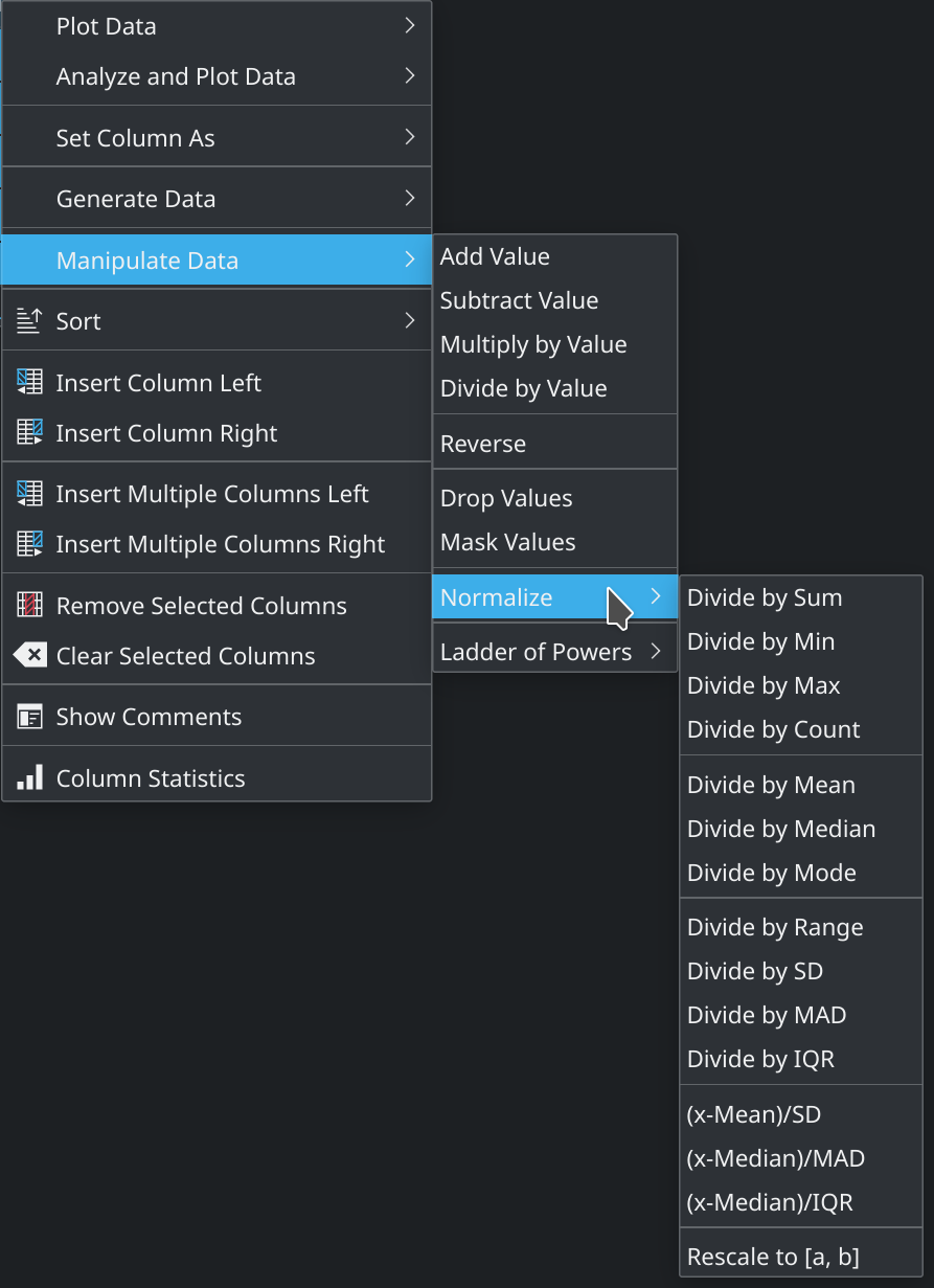
The normalization methods list has also been extended and we added a couple of new frequently used methods:
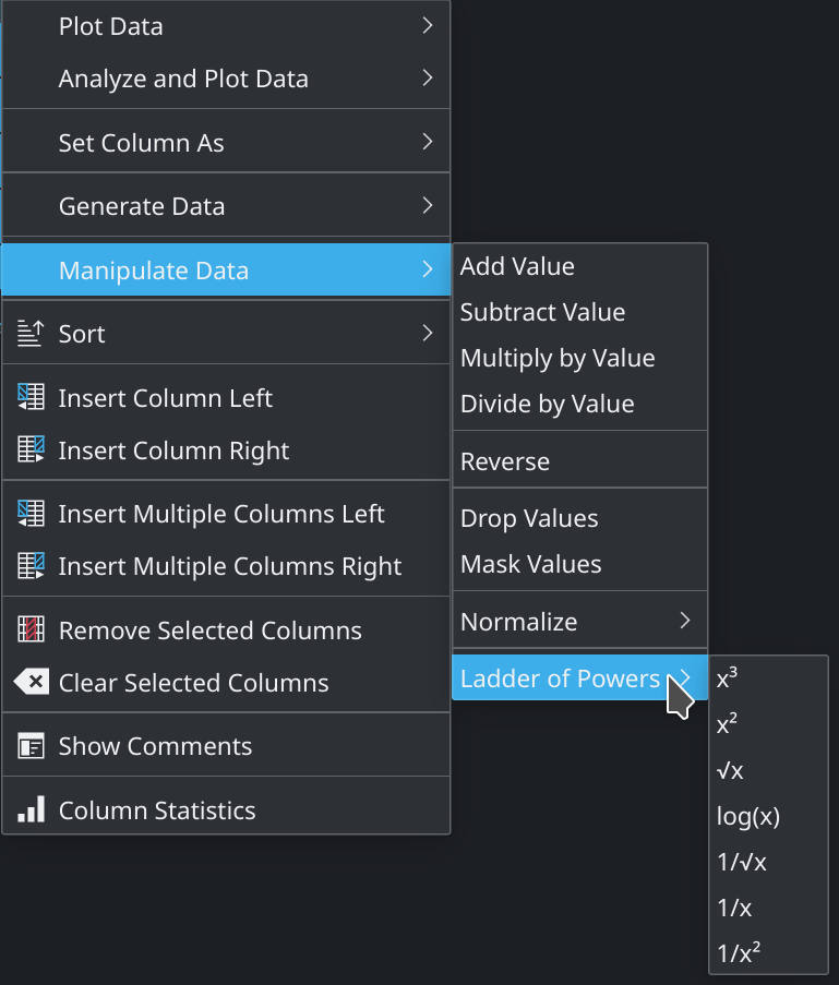
Furthermore, we added another small feature to the spreadsheet: the calculation of Tukey’s ladder of powers:
Data Analysis
LabPlot supports different analysis methods, such as fitting, smoothing, Fourier transformation, etc. The fitting capabilities have been improved with an extended dialog.
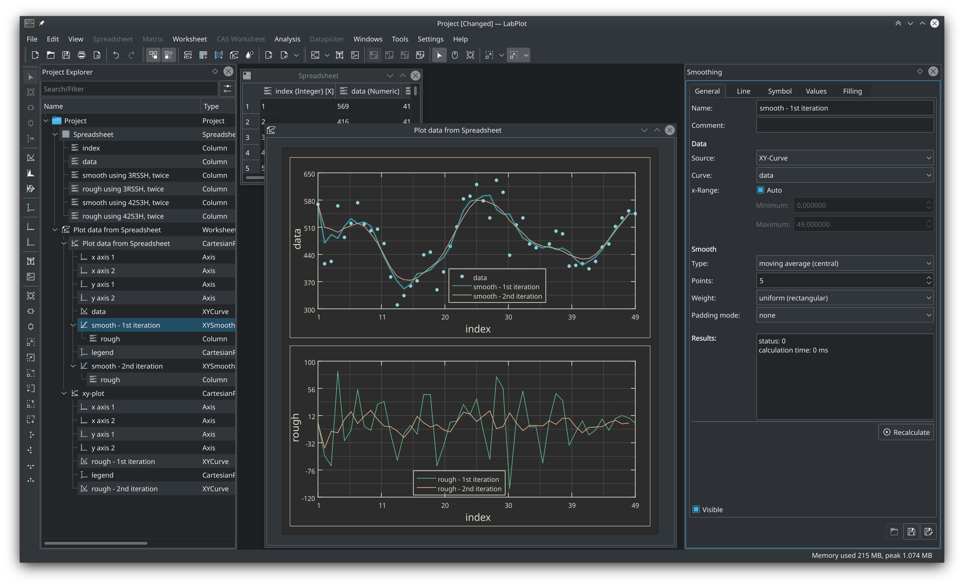
For smoothing, we added the calculation of rough values. The difference between the approximating smooth function and the original data is called “rough” in this context (data = smooth + rough). We calculate and expose the rough values and made it possible to visualize them and to check the goodness of the smoothing process. The example below demonstrates the first two plot iterations of a moving average smoothing algorithms applied to the original data. The second plot shows the corresponding rough values for both iterations:
Computer Algebra Systems
Thanks to the work carried out on Cantor during the last months, in this release of LabPlot we have been able to add compatibility with Jupyter project files:
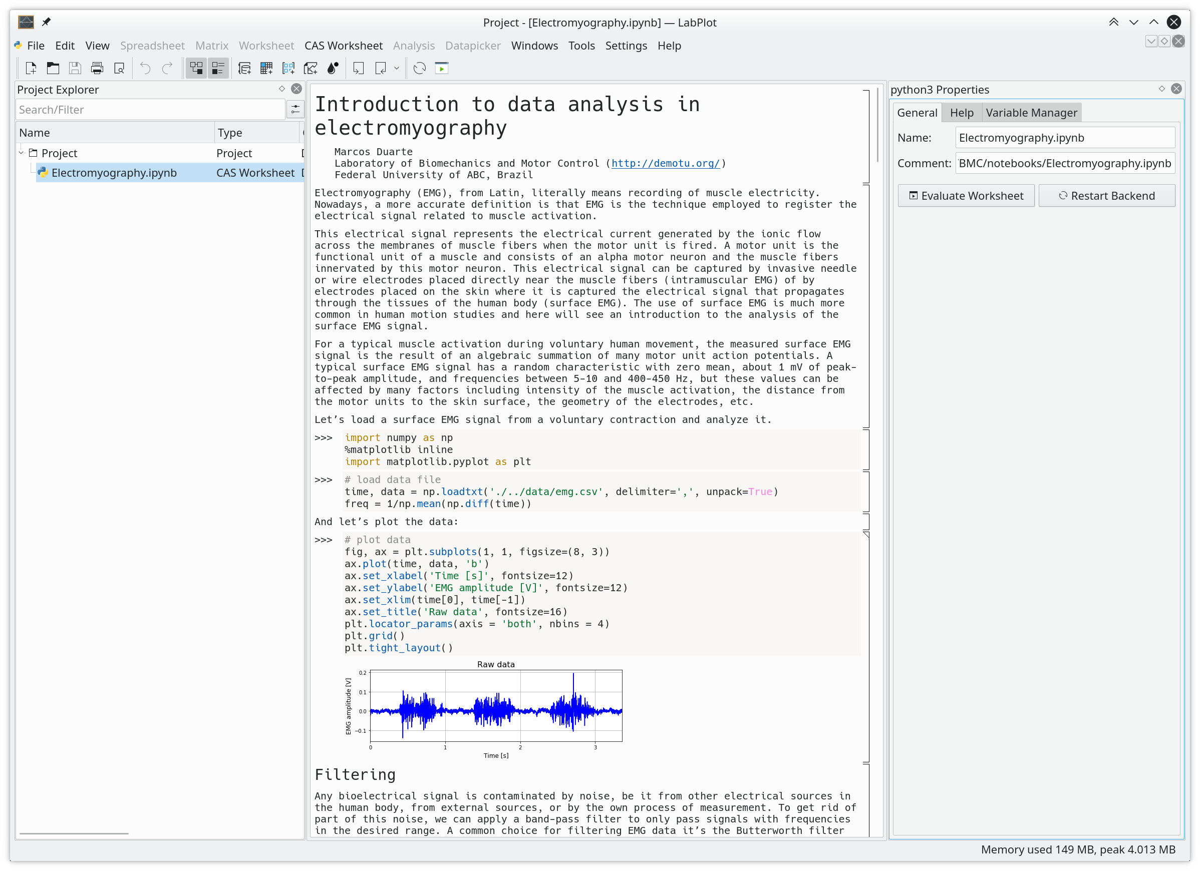
Contrary to Cantor which is able to open and save .ipynb files (Jupyter notebooks), LabPlot allows only to open such projects. After loading a notebook, its content is shown in a computer algebra worksheet in LabPlot. The modified CAS Worksheet can be saved in a native project file together with other native objects, such as spreadsheets, worksheets, etc.
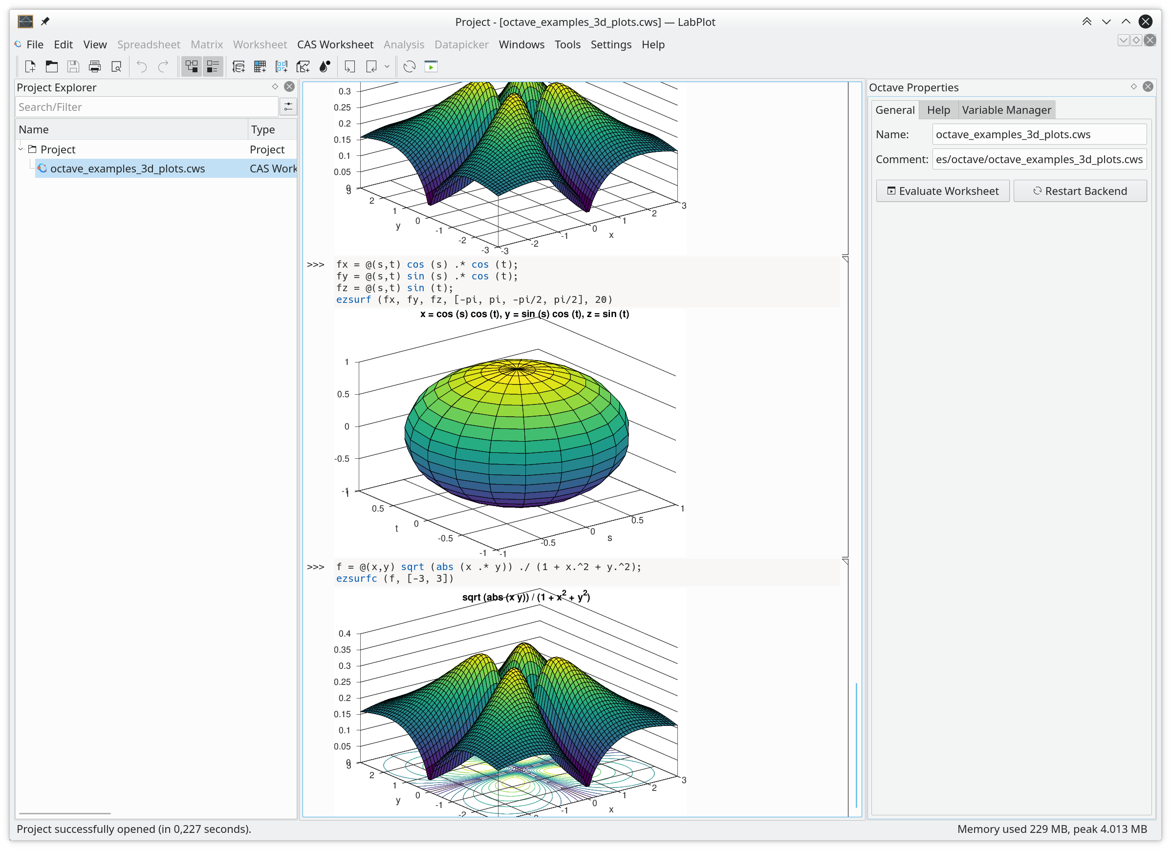
It was already possible to create new CAS Worksheets in LabPlot wherever the machinery of Cantor was used internally — see this blog post for couple of examples. But it was not possible to open Cantor’s project files (*.cws file extension) directly . We have corrected this and the handling of Cantor project files is similar now to the handling of Jupyter projects described above.
The screenshot below shows an Octave project from Cantor’s collection of example projects for different computer algebra systems:
Settings for Units and Decimal Separator
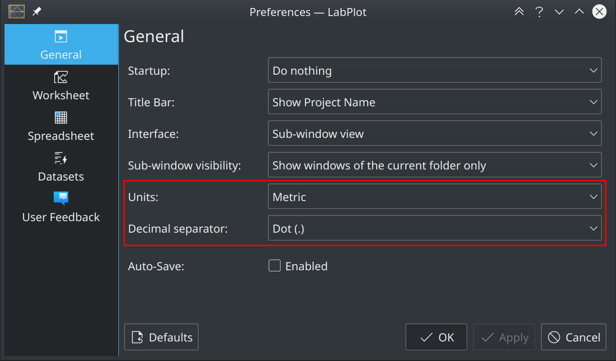
It’s possible now to globally define which units (metric or imperial) and which decimal separator (dot, comma, Arabic comma, system default) have to be used everywhere in the application. The settings dialog was extended for this:
Better Support on macOS
More effort has been put into the macOS version of LabPlot. Besides many small macOS specific fixes, we have also added support for the touch bar that is available on newer MacBook Pro models. In the touch bar we expose the most frequently used actions for the different objects. The screenshot below shows the touch bar with worksheet actions:

this is a great release on my x86 computer, however installing them on manjaro arm on the pinebook reveals that the analyzing part of the program failed to perform. Well at least I would still be able to draw beautiful graphs hahaha.
can you please report this failure on bugs.kde.org?