LabPlot 2.3.0 released
Less then four months after the last release and after a lot of activity in our repository during this time, we’re happy to announce the next release of LabPlot with a lot of new features. So, be prepared for a long post.
As already announced couple of days ago, starting with this release we provide installers for Windows (32bit and 64bit) in the download section of our homepage. The windows version is not as well tested and maybe not as mature as the linux version yet and we’ll spent more time in future to improve it. Any feedback from windows users is highly welcome here!
With this release me make the next step towards providing a powerful and user-friendly environment for data and visualization. Last summer Garvit Khatri worked during GSoC2015 on the integration of Cantor, a frontend for different open-source computer algebra systems (CAS). Now the user can perform calculations in his favorite (open-source) CAS directly in LabPlot, provided the corresponding CAS is installed, and do the final creation, layouting and editing of plots and curves and the navigation in the data (zooming, shifting, scaling) in the usuall LabPlot’s way within the same environment. LabPlot recognizes different CAS variables holding array-like data and allows to select them as the source for curves. So, instead of providing columns of a spreadsheet as the source for x- and y-data, the user provides the names of the corresponding CAS-variables.
Currently supported CAS data containers are Maxima lists and Python lists, tuples and NumPy arrays. The support for R and Octave vectors will follow in one of the next releases.
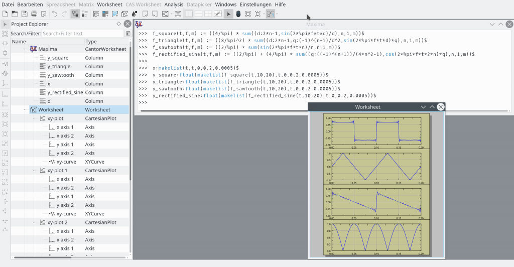
Let’s demonstrate the power of this combination with the help of three simple examples. In the first example we use Maxima to generate commonly used signal forms – square, triangle, sawtooth and rectified sine waves (“imperfect waves” because of the finite truncation used in the definitions):
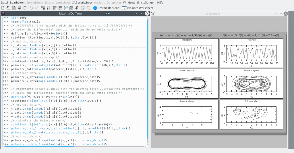
In the second example we solve the differential equation of the forced Duffing oscillator, again with Maxima, and plot the trajectory, the phase space of the oscillator and the corresponding Poincaré map with LabPlot to study the chaotic dynamics of the oszillator:
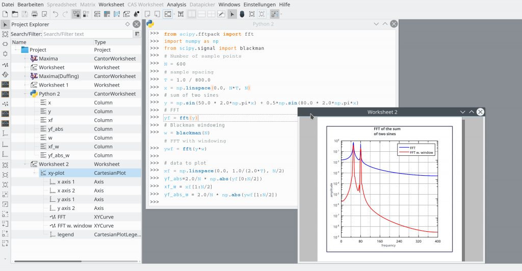
Python in combination with NumPy, SciPy, SymPy, etc. became in the scientific community a serious alternative to many other established commercial and open-source computer algebra systems. Thanks to the integration of Cantor, we can do the computation in the Python environment directly in LabPlot. In the example below we generate a signal, compute its Fourier transform and illustrate the effect of Blackman windowing on the Fourier transform. Contrary to this example, only the data is generated in python, the plots are done in LabPlot.
In this release with greatly increased the number of analysis features.
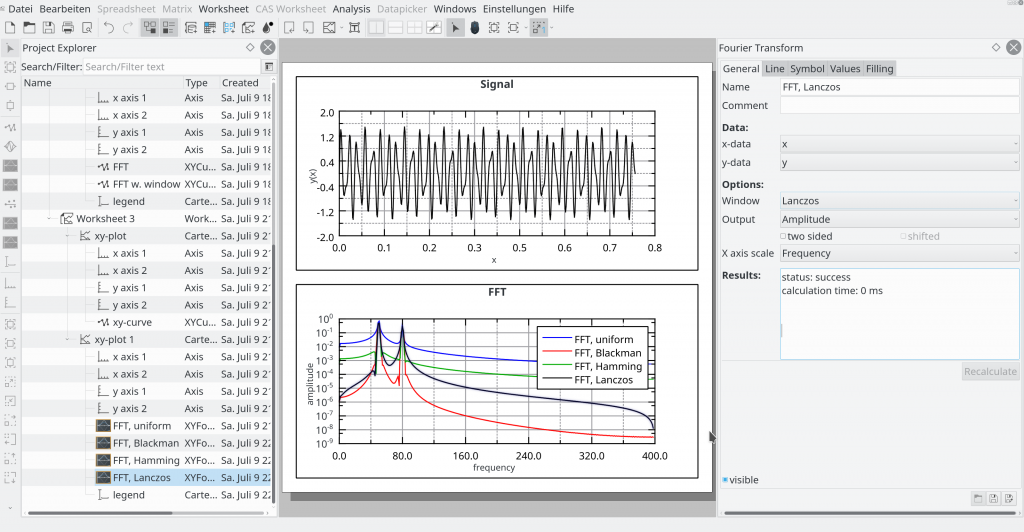
Fourier transform of the input data can be carried out in LabPlot now. There are 15 different window functions implemented and the user can decide which relevant value to calculate and to plot (amplitude, magnitude, phase, etc.). Similarly to the last example above carried out in Python, the screenshot below demonstrates the effect of three window functions where the calculation of the Fourier transform was done in LabPlot directly now:
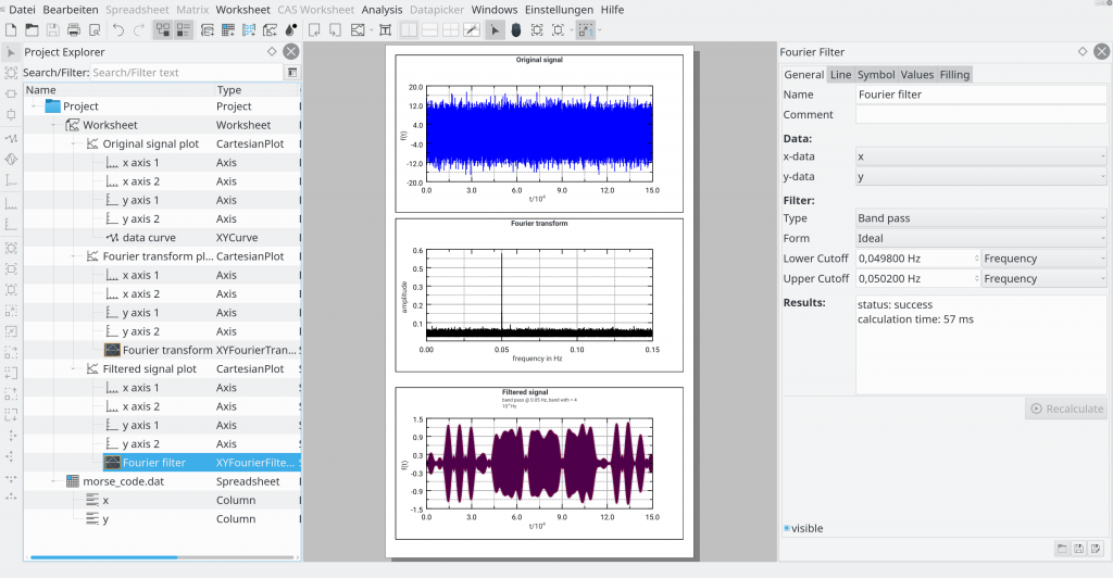
For basic signal processing LabPlot provides Fourier Filter (or linear filter in the frequency domain). To remove unwanted frequencies in the input data such as noise or interfering signals, low-pass, high-pass, band-pass and band-reject filters of different types (Butterworth, Chebyshev I+II, Legendre, Bessel-Thomson) are available. The example below, inspired by this tutorial, shows the signal for “SOS” in Morse-code superimposed by a white noise across a wide range of frequencies. Fourier transform reveals a strong contribution of the actual signal frequency. A narrow band-pass filter positioned around this frequency helps to make the SOS-signal clearly visible:
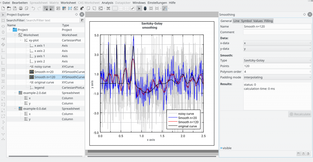
Another technique (actually a “reformulation” of the low-pass filtering) to remove unwanted noise from the true signal is smoothing. LabPlot provides three methods to smooth the data – moving average, Savitzky-Golay and percentile filter methods. The behavior of these algorithms can be controlled by additional parameters like weighting, padding mode and polynom order (for Savitzky-Golay method only).
To interpolate the data LabPlot provides several types of interpolations methods (linear, polynom, splines of different types, piecewise cubic Hermite polynoms, etc.). To simplify the workflow for many different use-cases, the user can select what to evaluate and to plot on the interpolations points – function, first derivative, second derivative or the integral. The number of interpolation points can be automatically determined (5 times the number of points in the input data) or can be provided by the user explicitly.
More new analysis features and the extension of the already available feature set will come in the next releases.
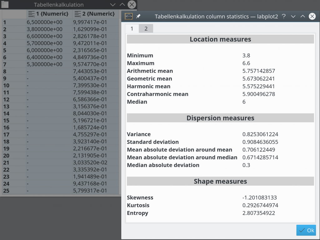
Couple of smaller features and improvements were added. The calculation of many statistical quantities was implemented for columns and rows in LabPlot’s data containers (spreadsheet and matrix):
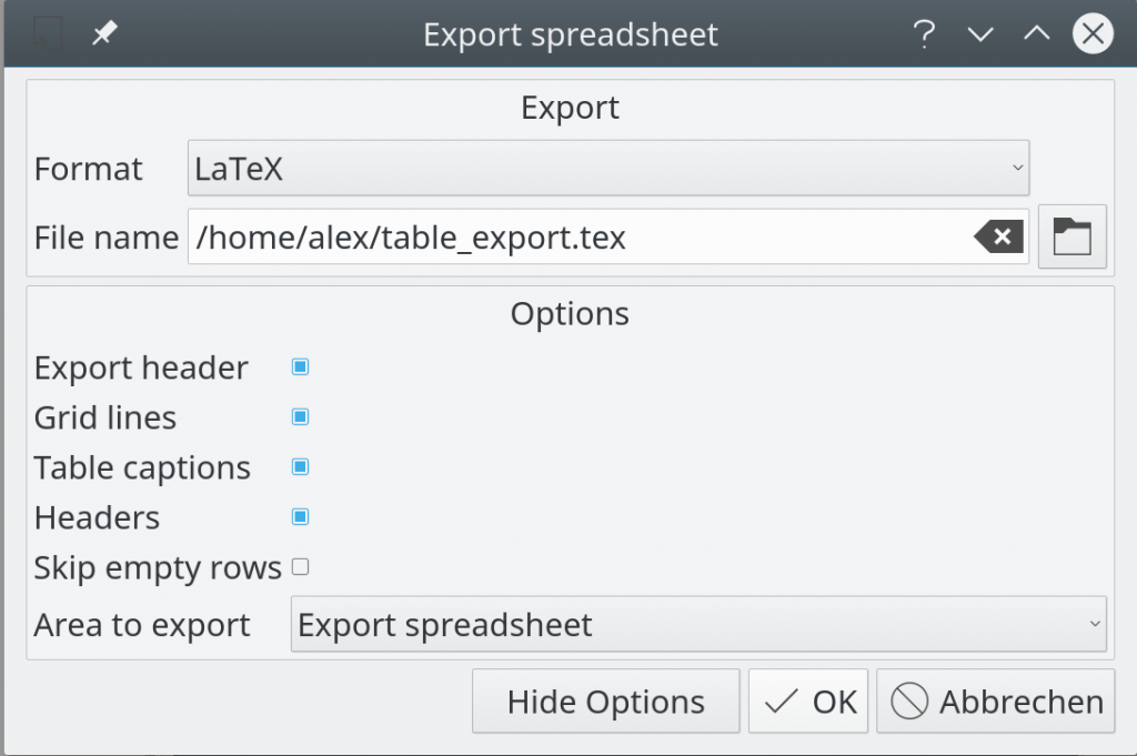
Furthermore, the content of the data containers can be exported to LaTeX tables. The appearance of the final LaTeX output can be controlled via several options in the export dialog.
To further improve the usability of the application, we implemented filter and search capabilities in the drop down box for the selection of data sources. In projects with large number of data sets it’s much easier and faster now to find and to use the proper data set for the curves in plots.
A new small widget for taking notes was implemented. With this, user’s comments and notes on the current activities in the the project can be stored in the same project file:
To perform better on a large number of data points, we implemented the double-buffering for curves. Currently, applying this technique in our code worsens the quality of the plotted curves a bit. We decided to introduce a configuration parameter to control this behavior during the run-time. On default, the double buffering is used and the user benefits from the much better performance. Users who need the best quality should switch off this parameter in the application settings dialog. We’ll fix this problem in future.
The second performance improvement coming in version 2.3.0 is the much faster generation of random values in the spreadsheet.
There are still many features in our development pipeline, couple of them being currently already worked on. Apart from this, this summer again we get contribution from three “Google Summer of Code” students working on the support for FITS, on a theme manager for plots and on histograms.
You can count on many new cool features in the near future!

Do you plan to include life data analysis capabilities (Weibull, Log-normal, etc.) in a future version of Labplot?
It is possible to do linear and non-linear regression analysis in LabPlot already. Weibull and log-normal distributions are not part of the “pre-defined fit models”. But we support “custom fit models” where the user can define arbitrary fit models and their parameters. We can easily add new functions/distributions to the list of pre-defined fit models in future, of course.
So, just import your life data, create a worksheet, add a plot and a fit curve, select the data you want to fit and define the fit model by providing the mathematical expression for the Weibull distribution.
Or is there more about “life data analysis”? Does it also include using of Weibull plots like described here http://www.itl.nist.gov/div898/handbook/eda/section3/weibplot.htm ?
Fitting the Weibull distribution to a data set would be the first step. As you already found in the Engineering Statistics Handbook, there are further aspects to Weibull analysis. It is widely used to analyse life data for reliability purposes. There are proprietary software packages, specifically designed for life data analysis (e.g. WinSMITH Weibull, or ReliaSoft Weibull++). AFAIK, ‘R’ would currently be the only open source option, but that is far from being user friendly.
Therefore, I thought it would be cool if LabPlot could be used as an open source alternative to the proprietary, Windows-only options.
Adding new distributions to the list of pre-defined fit models is quite easy. We’ll add Weibull, Gumbel and Log-Normal distributions in the next release. Until then it’s still possible to use “custom fit model” and to provide manually the mathematical expression for them. Weibull-plot should also be relatively easy to implement. Let’s see how fast we can do this.
I had a short look at WinSmith and Weibull++. I think with couple of new domain-specific wizards, some extended reports on the analysis results and with what we already have now in LabPlot (import of data, organization of data and plots, navigation and zooming, export to PDF, etc.) we can compete with such commercial products. I’ll have a deeper look at those products to see what else can be added to LabPlot in future.
COOL!
I can’t get smoothing to work properly if “Date” column is set as X value. It works fine if the date values are treated as numeric but then the timeline is lost.
“status: Not enough data points available.”
Hello, I cannot install labplot-2.7.0-64bit-setup either on Windows10 nor Windows. The error message says:
The code execution cannot proceed because MSVCR120.dll was not found. Reinstalling the program may fix this problem. // Any suggestions?
We released today 2.8 – https://labplot.kde.org/2020/09/16/labplot-2-8-released/. This library shouldn’t be used anymore. Can you please try 2.8?