LabPlot 2.0.2 released
We are glad to announce the release of the next version of LabPlot – 2.0.2, which can be downloaded here. Though we’ve only increased the minor number (we’re still in the process of completing the 2D-plotting part), there was a lot of development done for this release. Many new features were implemented and the responsiveness of the application was improved in many cases.
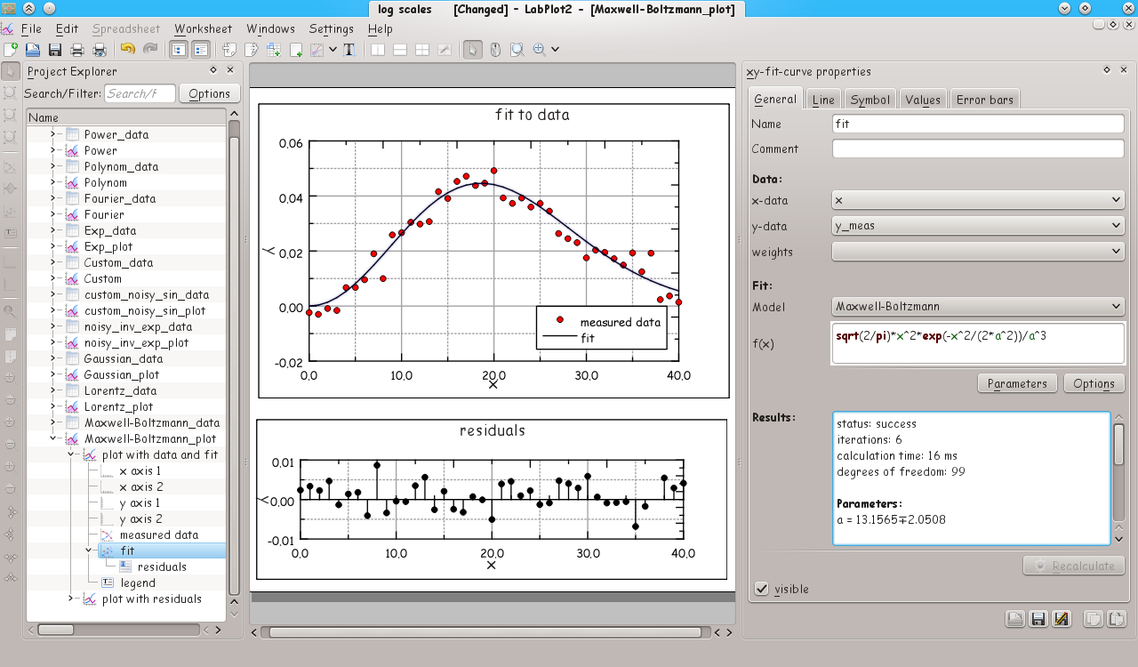
With this release we started to implement what is usually named as “data analysis” in plotting software and we’ll add new analysis features gradually in the next releases. We hope to quickly close the gap in this area to the feature set that was available in the old (kde3-based) version of LabPlot. The first step in this direction is linear and non-linear regression analysis available now in LabPlot. Creating a fit to data is easy – given the data sets in a spreadsheet, one adds a new “xy-curve from a fit to data” to a plot and provides the data to be fitted and the mathematical model. Here, several predefined fit models are provided. User-defined models are also possible. The fit to the data is shown as the curve in the plot once the calculation is done and the goodness of the fit is documented with the help several parameters like sum of squared errors etc.
With version 2.0.2 2D-curves defined by mathematical equations in cartesian and polar coordinates or via a parametric equation can be plotted. This is done just by adding a “xy equation curve” to the plot and by providing the mathematical expression and ranges defining that curve.
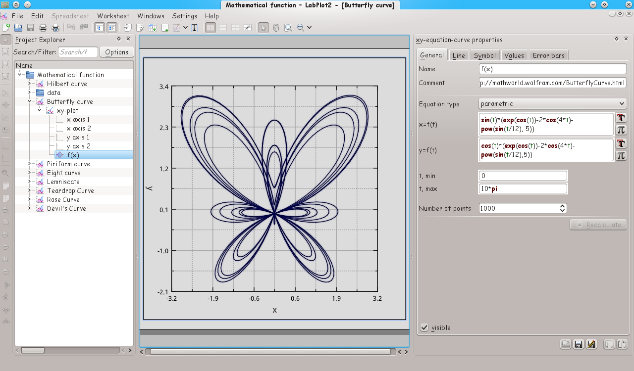
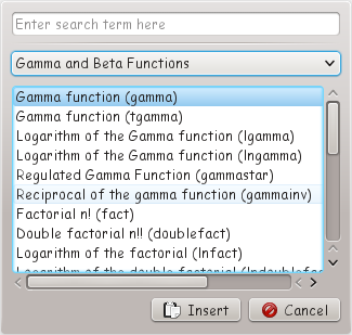
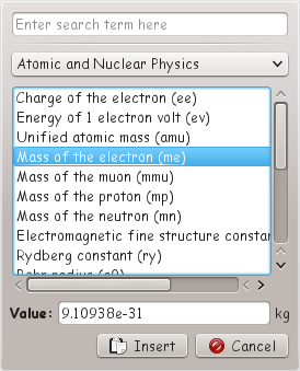
The text field for the mathematical equation helps the user with syntax completion and highlighting. Two dialogs where all supported mathematical and physical constants and functions help further with the definition of mathematical expressions.
In addition to the two big new features described above, many smaller features and improvements were implemented.
Besides fixed worksheet sizes (predefined sizes like A4 etc. or user-defined), complete view size for the worksheet can be used. In this case the worksheet fills the complete window area availble. All sizes of the worksheet and its children are automatically adjusted if the application window is resized.
Different types of arrows can now be drawn for the axis.
![]()
Though the number and the position of axes in a plot in LabPlot is arbitrary and can be easily controlled and changed by the user, four templates were provided for the four plot types most commonly used – boxed plot with four axes, box plot with two axes, plot with two centered axes (placed at the center of the plot) and plot with two axis crossing at the origin point (0,0). These templates are reachable via the tool bar or the context menu of the worksheet.
Several worksheet objects like plot area, plot legend etc. can draw now rounded borders.
Further smaller features implemented in LabPlot 2.0.2 are new formats for axis tick labels – “powers of 10”, “powers of 2” and “powers of e” – and three additional types for drop lines in a xy-curve – “zero baseline”, “min baseline” and “max baseline”. The new drop line typ “zero baseline” e.g. is usefull when plotting residuals stemming from a fit where one wants to visualize the absolute error (the distance to the zero baseline) of the fit for each single data point like in the plot with the fit to data shown above.
The navigation through the plotted data was improved. The user can zoom into the shown data with the mouse via “select region and zoom in”, “select x-region and zoom in”, “select y-region and zoom in” mouse modes. Also, simultaneous zooming and navigation accross multiple plots is possible now.
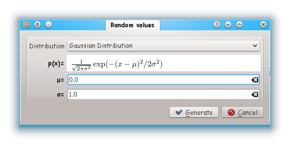
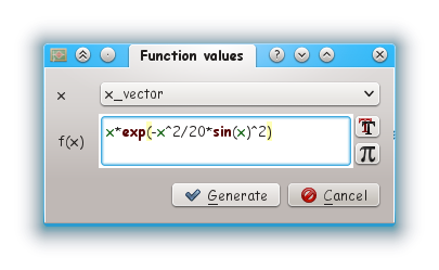
The spreadsheet – the central object in LabPlot providing data – was extended by several methods for data generation. A column can be filled with a constant value provided by the user or with equidistant values. Lesser trivial use-cases for data generation are filling of columns with uniform and non-uniform random numbers, whereas several distributions are available for the second case, and filling of columns with values of a mathematical function.
Data in a spreadsheet can be exported now to a text file. The export of a worksheet to a PNG-image was extended by an option for the image resolution.
Finally, many improvements regarding the performance of the application were done. The import of ascii-data into a spreadsheet gained a huge speedup. Also, faster plotting of bigger data is now possible with LabPlot. Save and load of projects is now much faster then in the previous version.
Thanks to the KDE translators, translations are available for Bosnian, Brazilian Portuguese, English, Dutch, French, German, Polish, Portuguese, Spanish, Swedish and Ukrainian (and partially for couple of other languages).
This is the fist release of LabPlot being part of KDE. I want to thank to everybody who helped with the transition to the KDE-infrastructure. Especial kudos goes to Ben Cooksley an to Yuri Chornoivan who introduced me into many different topics regarding the KDE infrastructure (git, translations, documentation etc.) in private communications, to Andreas Cord-Landwehr who prepared the new site on edu.kde.org and to Andreas Kainz who completed the oxygen icons used in LabPlot and who created also the breeze icon set for LabPlot.
Also, I want to thank here Matthias Mailänder who continues to help with testing of the release candidates, checking the readiness of the tarball to be rpm-packaged and who prepares packages for openSUSE.