The Universe full of hydrogen and … a new feature in LabPlot
The Universe is full of the hydrogen and one of its emission lines that is very important in astronomy is caused by the hyper-fine interaction. This electromagnetic radiation has the frequency of ca. 1420.4 MHz which corresponds to the vacuum wavelength of ca. 21cm.
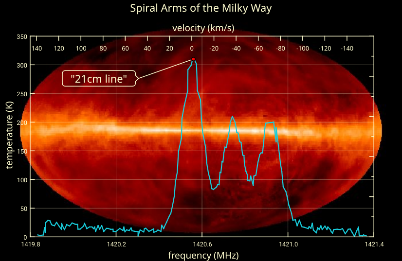
Observations performed at this wavelength reveal many structures in the Universe. The following plot shows the results of such observations in the Milky Way:
The background image used here represents an all-sky survey with radio telescopes at the wavelength of 21 cm. the image uses false colors to show the information and the plane of our Milky Way galaxy is the lighter stripe running horizontally through the center.
The curve shows the intensities observed at longitude 90° and latitude 0° (galactic coordinates). The first peak with the greatest intensity corresponds to the emission in the local hydrogen cloud, while the two peaks with smaller intensities are mapped to clouds in the Perseus and Outer arms, respectively (data taken from here). Because of their velocities relative to us and because of the Doppler-Effect, the frequencies for these two spiral arms appear to be blue-shifted. See link 1, link 2, link 3 and link 4 if you want to read more about this.
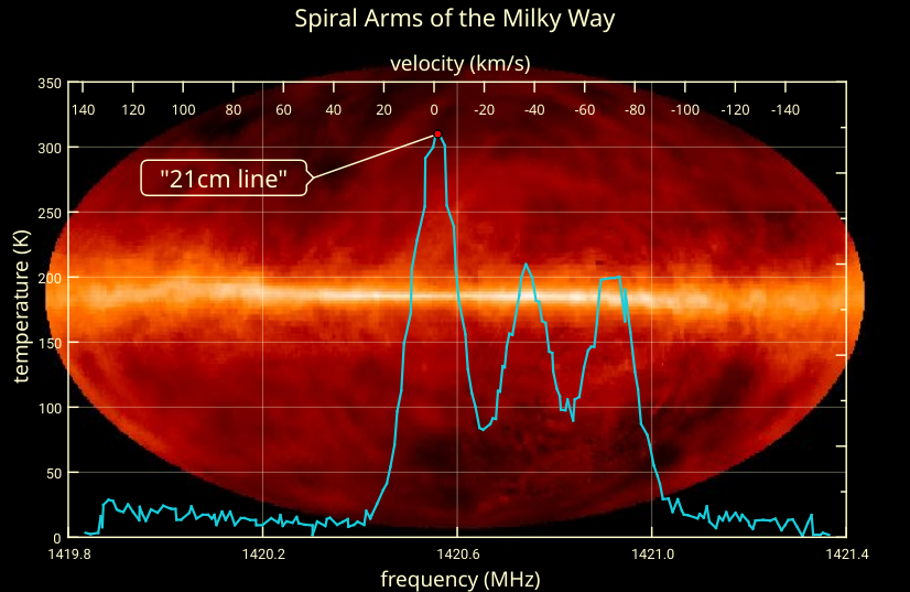
Besides the very interesting results shown here, this plot also shows a new feature in LabPlot: the Info Element.
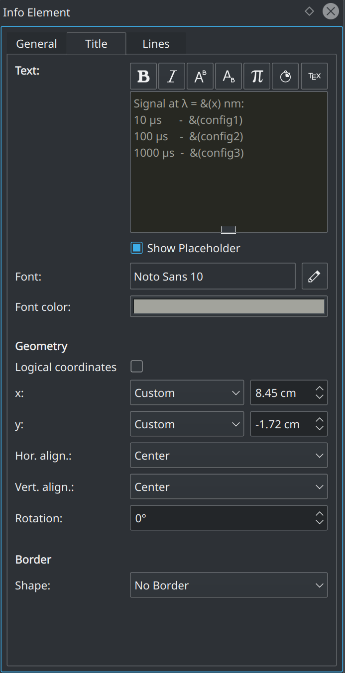
This Info Element allows you to annotate values and positions in a plot. You specify the value that needs to be highlighted/annotated and the position of the text label, as well as the properties of the lines (the connection line and the vertical line, if needed) can be freely changed. The Info Element sticks to the specified position during the navigation in the data.
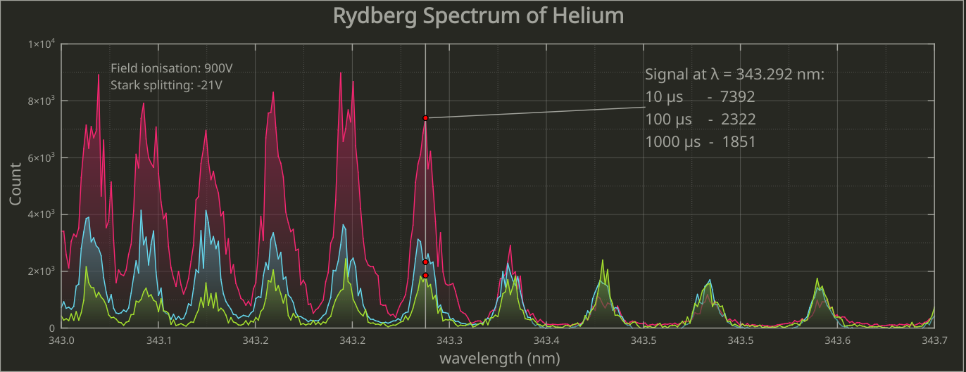
The new Info Element is also easy to use when the same position needs to be annotated for multiple curves in the plot. To do this, select the curves and specify which curve to use to connect the line to. The final result can look something like what you see in the following plot:
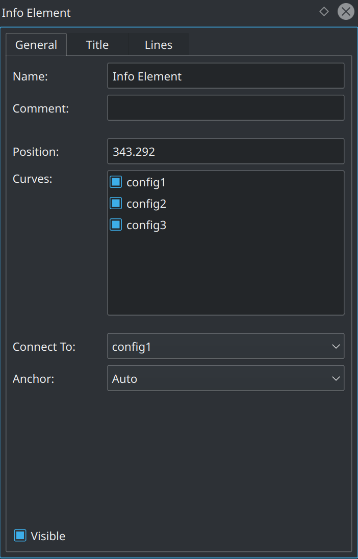
The properties of the text shown in the Info Element are modified in a similar fashion to the properties of the usual text labels, but include the additional syntax for “placeholders” for x- and y-values:
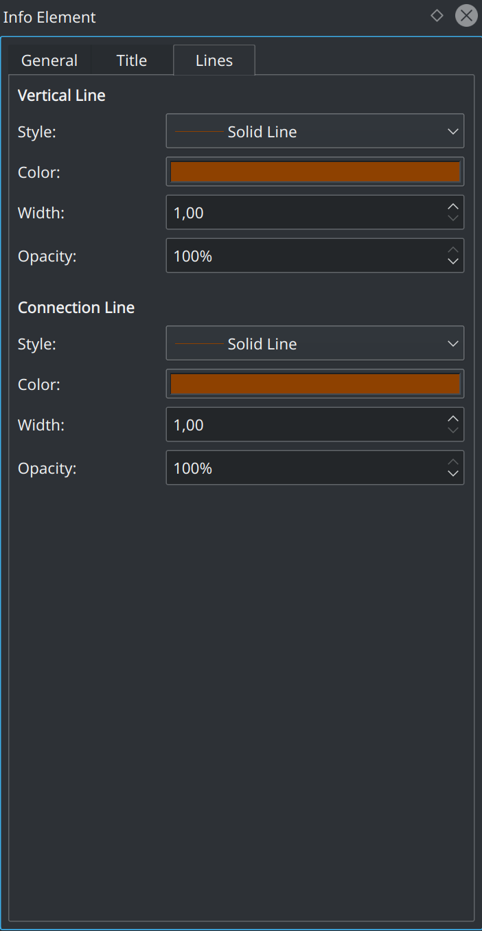
Finally, the properties of the connection and of the vertical lines are modified similarly to other line objects on the worksheet:
What a wonderful example to illustrate the bounties of FOSS! THANK YOU.
[…] a long time in the lab, but a short time compared to the ~13+ billion year history of our galaxy. (Credit: J.Dickey/NASA […]
[…] (Credit score: J.Dickey/NASA SkyView) […]
[…] (Credit: J.Dickey/NASA SkyView) […]
[…] (Credit: J.Dickey/NASA SkyView) […]